
My team worked with Sparkset as part of UCI Informatics’ Senior Design Thesis. During this 20-week course, groups of 5 students were paired with project sponsors from diverse backgrounds with the aim of developing a new digital product or enhancing an existing one.
Design: Delia Gomez, Sune Fahqir, Tyler Matsunami,
Dev: Nat Ruzicka, Paul Hennessee
Sparkset is a digital marketing agency that provides consultation services to small businesses. In this company, every client interacts with multiple Sparkset consultants, which means that employees would often have to consult each other first before engaging with the client to ensure that they are up to speed on the latest developments.
In an initiative to improve its operations, Sparkset spent one year developing an internal customer relationship management (CRM) web app. The CRM's role was to:
The problem was that Sparkset invested a lot of time and energy to develop this internal CRM, but only 10% of Sparkset employees adopted the system. As a consequence:
You would think that the internal CRM is a great initiative that would benefit consultants by saving them time and promoting the centralization of data. Unfortunately, the CRM has failed to meet those expectations even one year after launch.
My team's job was to figure out why the adoption rate was so low, and identify ways to improve it.

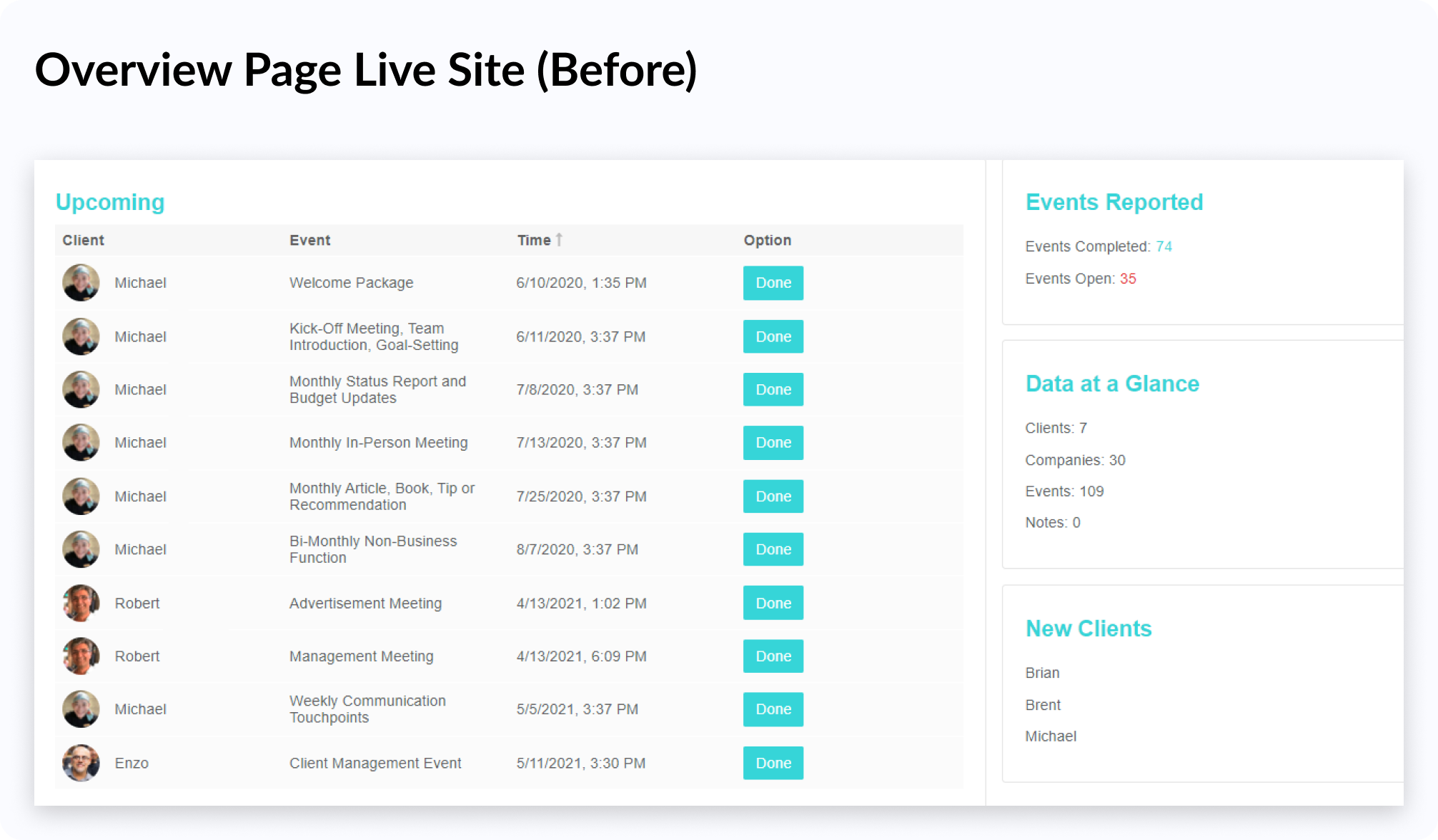
Old Sparkset Overview Page
Naturally, I decided to talk to people in order to figure out what was driving people away from the CRM. I conducted interviews with the CEOs, Ted and Tiffany and uncovered 3 key findings:
Unpolished Experience
Untested Interface
Lacking Features
The CRM felt unpolished and many features were broken, which was frustrating because such issues blocked consultant's workflows.
Usability testing (or quality control of any kind) has never been conducted on the system in over a year of design/development.
Employees who have tried the CRM feel that it does not support some key tasks they regularly perform.
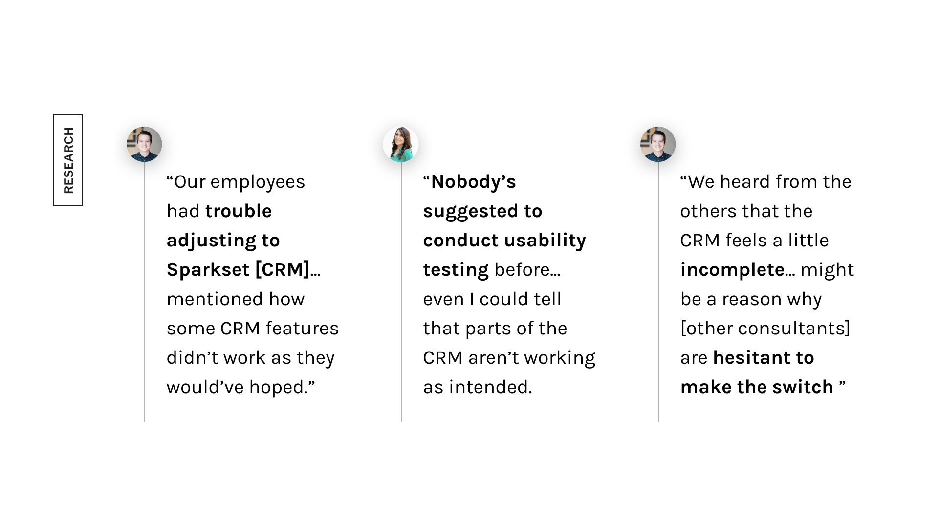
Insights from the user interviews
Out of the reasons the interview participants cited, our team thought the CRM's clunkiness and broken features invoked the most friction, which led to consultants abandoning the system.
Is there a solution that can make using the CRM a less frustrating experience?
How might we reduce feelings of frustration that come with using the CRM so that Sparkset consultants would be comfortable adopting the system?
From the interviews, we uncovered that user frustration was the primary factor driving people away from Sparkset's CRM, and conducted usability testing in order to:
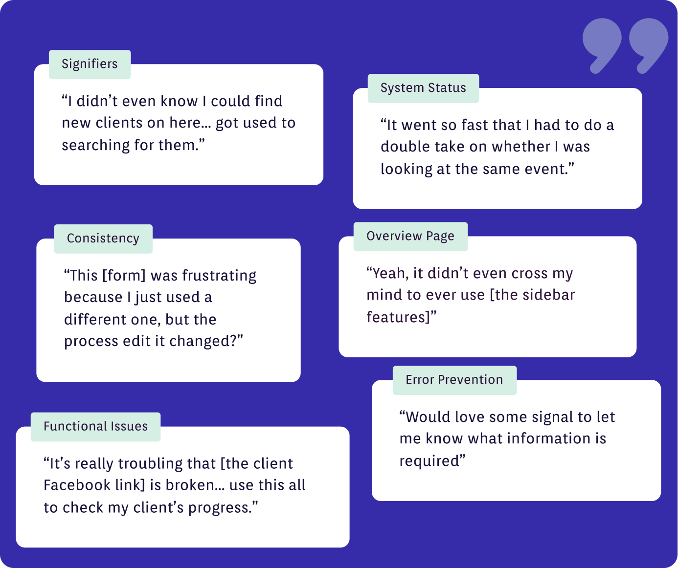
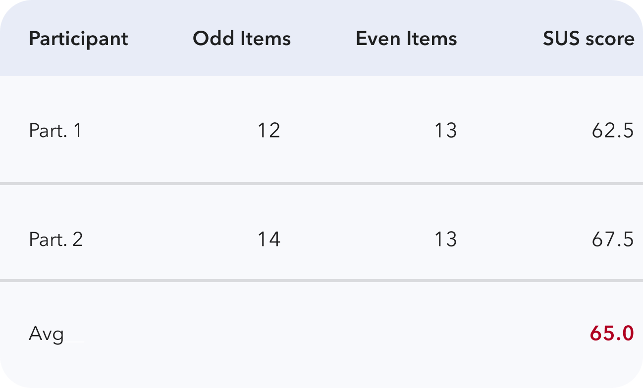
We also took the opportunity to conduct a system usability scale (SUS) survey, that informs us how easy and satisfying it was for participants to use the Sparkset CRM.
Now that we benchmarked the CRM’s experience and the identified areas that were catalysts for user frustration, we began designing changes to improve the interface. These changes were separated into three categories: Usability fixes, functional fixes, and overview page changes.
We prioritized fixing the CRM's usability deficiencies because while not system-breaking, they can add friction to Sparkset consultants' workflows, and cause them to abandon the tool.
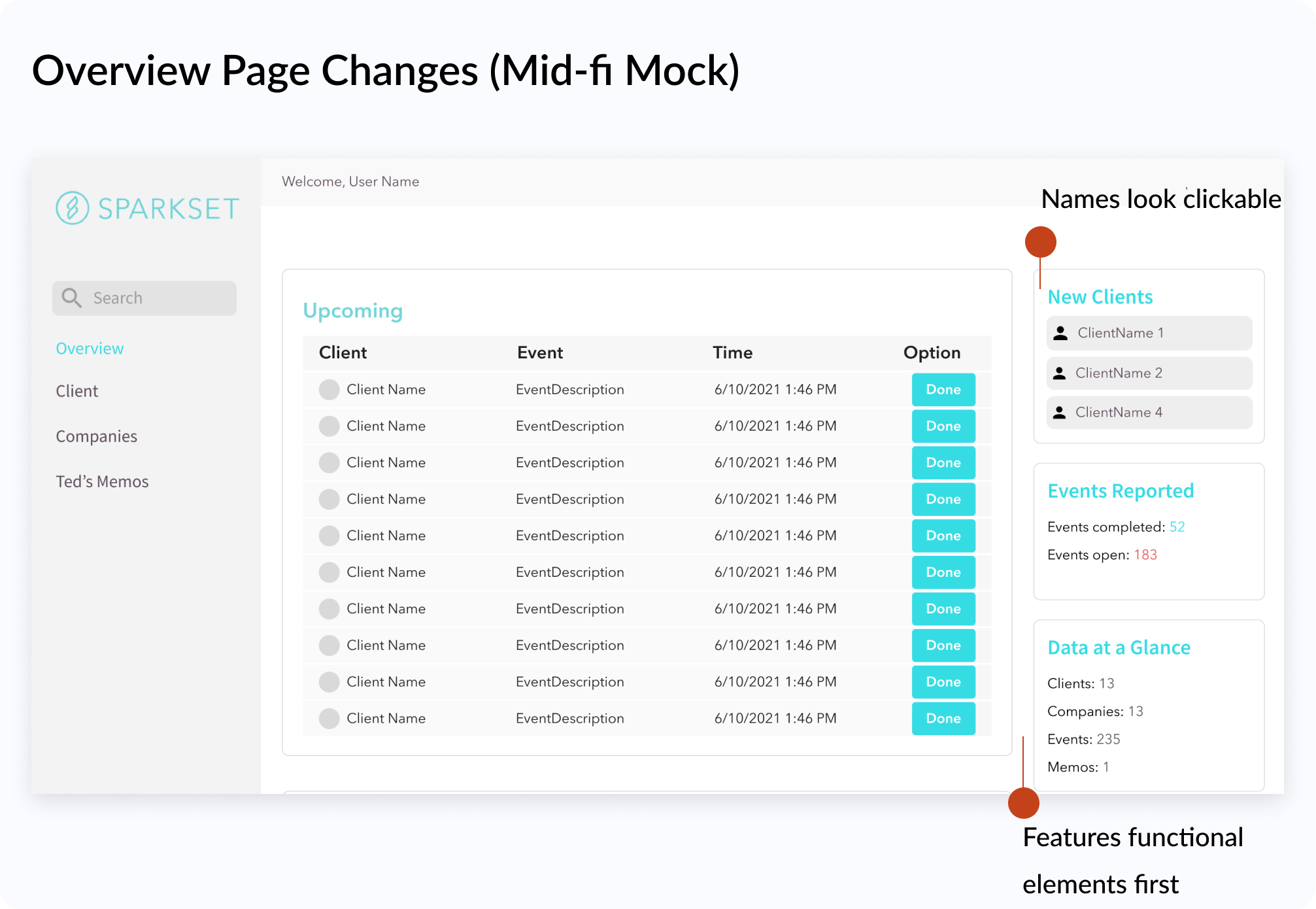
X An example of a usability issue could be seen on the overview page, where usability test participants missed the "New Clients" widget because there were no signifiers that implied clickability.
X Participants also mentioned how the ability to locate new clients quickly is valuable because Sparkset's onboarding process is very involved.
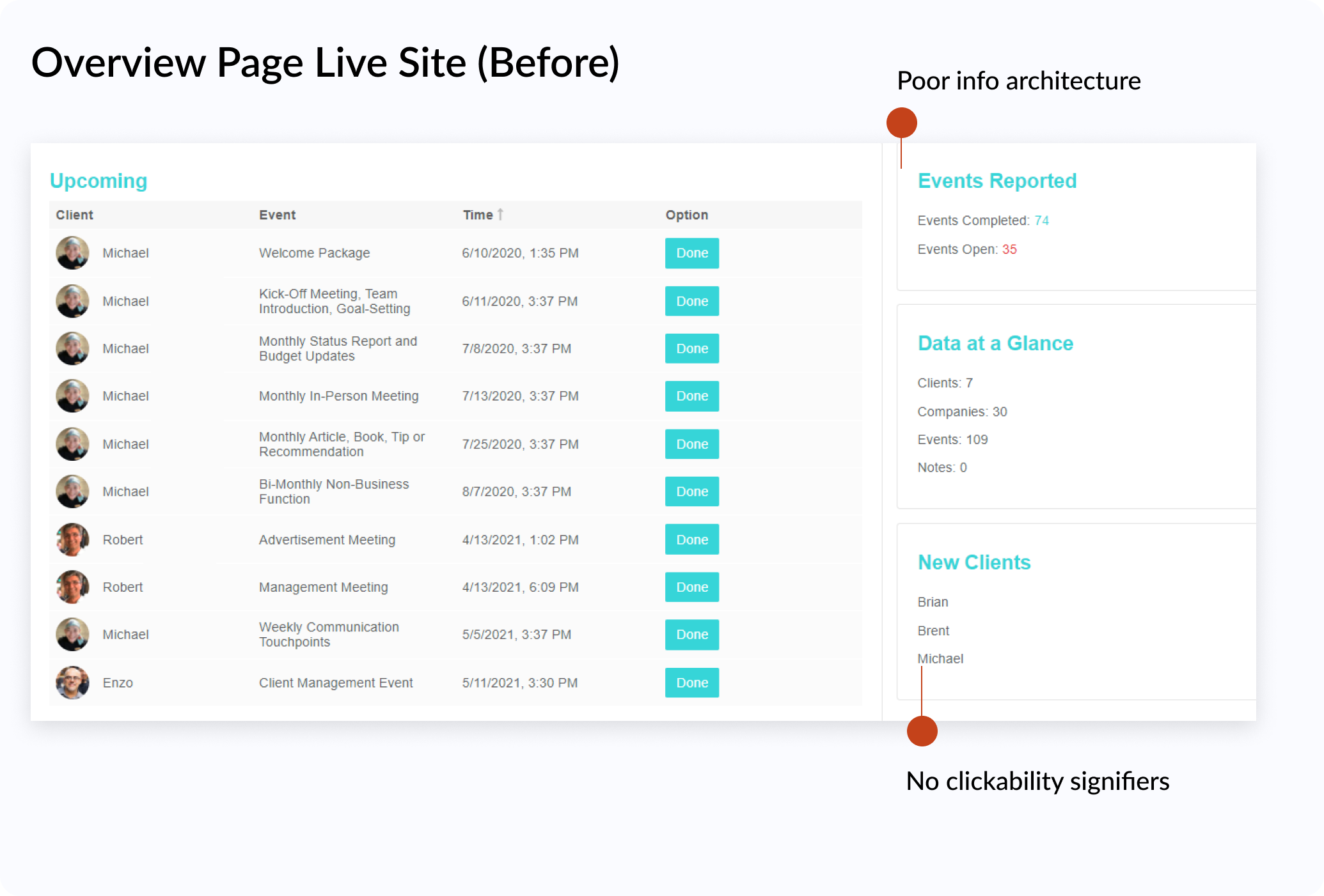
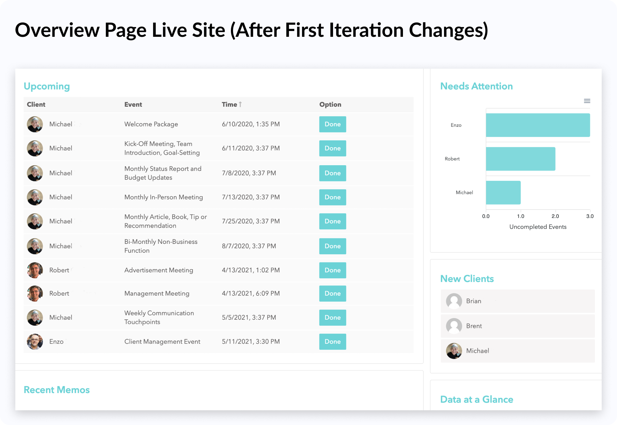
✅ To remedy the above issue, we gave clickability indicators to the names in the "New Clients" widget so that users will see that the component is interactive.
✅ Our team also rearranged the sidebar to prioritize its functional components. This allows users to see the most important information and features first.
We also patched the functional issues, and allowed Sparkset employees to access the Sparkset CRM's full capabilities. The functional issues were important to fix because they are typically associated with key consultant tasks.
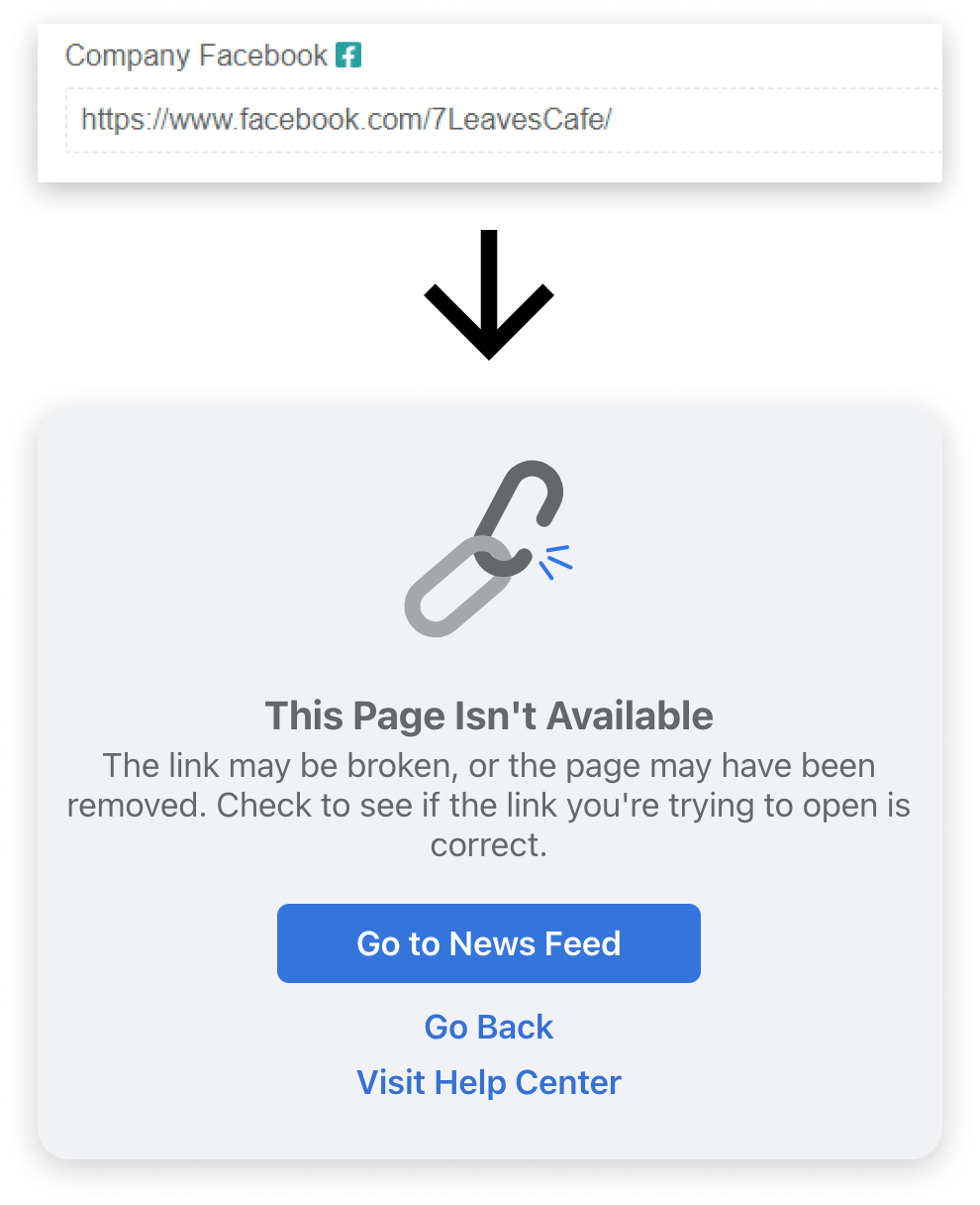
X During the usability test, Ted entered the full URL into the client information form when tasked with adding a Facebook link to a new client’s page.
X The client Facebook link was coded in a way where adding a URL as shown below results in an invalid link.
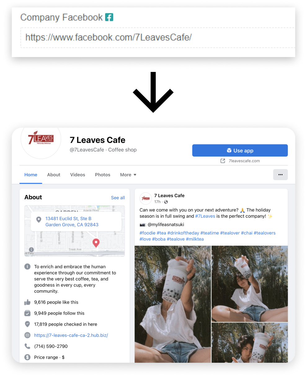
✅ We fixed this bug by removing code that prepends “facebook.com/” to users’ entries.
✅ Our change also made the CRM externally consistent with other websites, as users naturally enter full links when prompted for a URL.
My also team designed to remedy the poor overview page experience. The overview page sidebar was intended to provide consultants with tools and insights to improve their workflows.
During the usability assessment however, the sidebar was used zero times. This confirmed that the current state of the sidebar added little value to users and aligned with the Sparkset employees' feedback regarding the lack of features in the CRM.
Around this time, we also uncovered that an important part of digital marketers' workflows is to “triage clients and figure out who needs the most help." We saw this as an opportunity to improve the overview page's usefulness and started ideating sidebar additions with a mindmap.
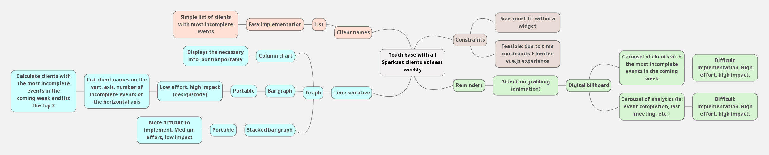
We selected three of the most promising candidates from the mind map and sketched out some visual explorations.
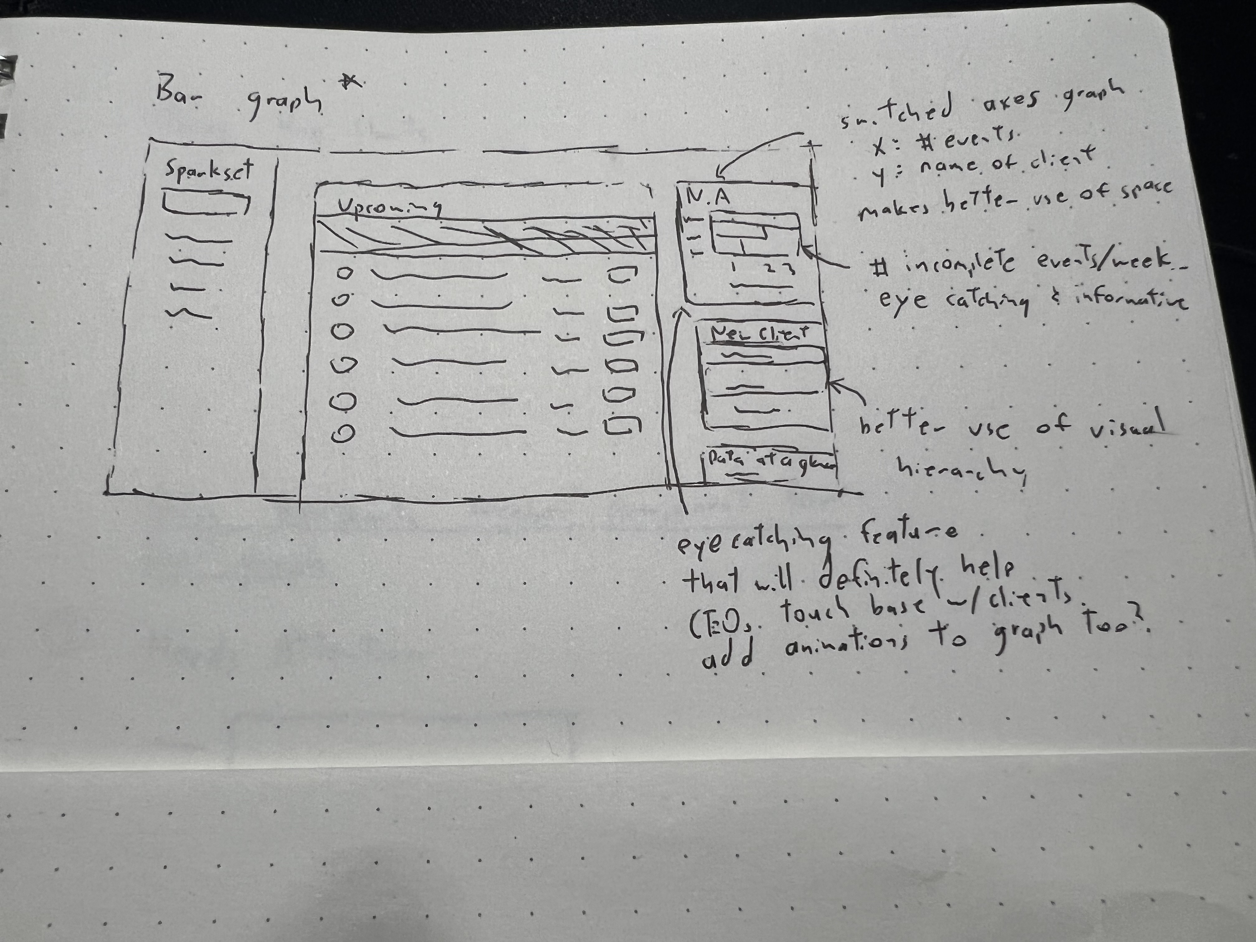
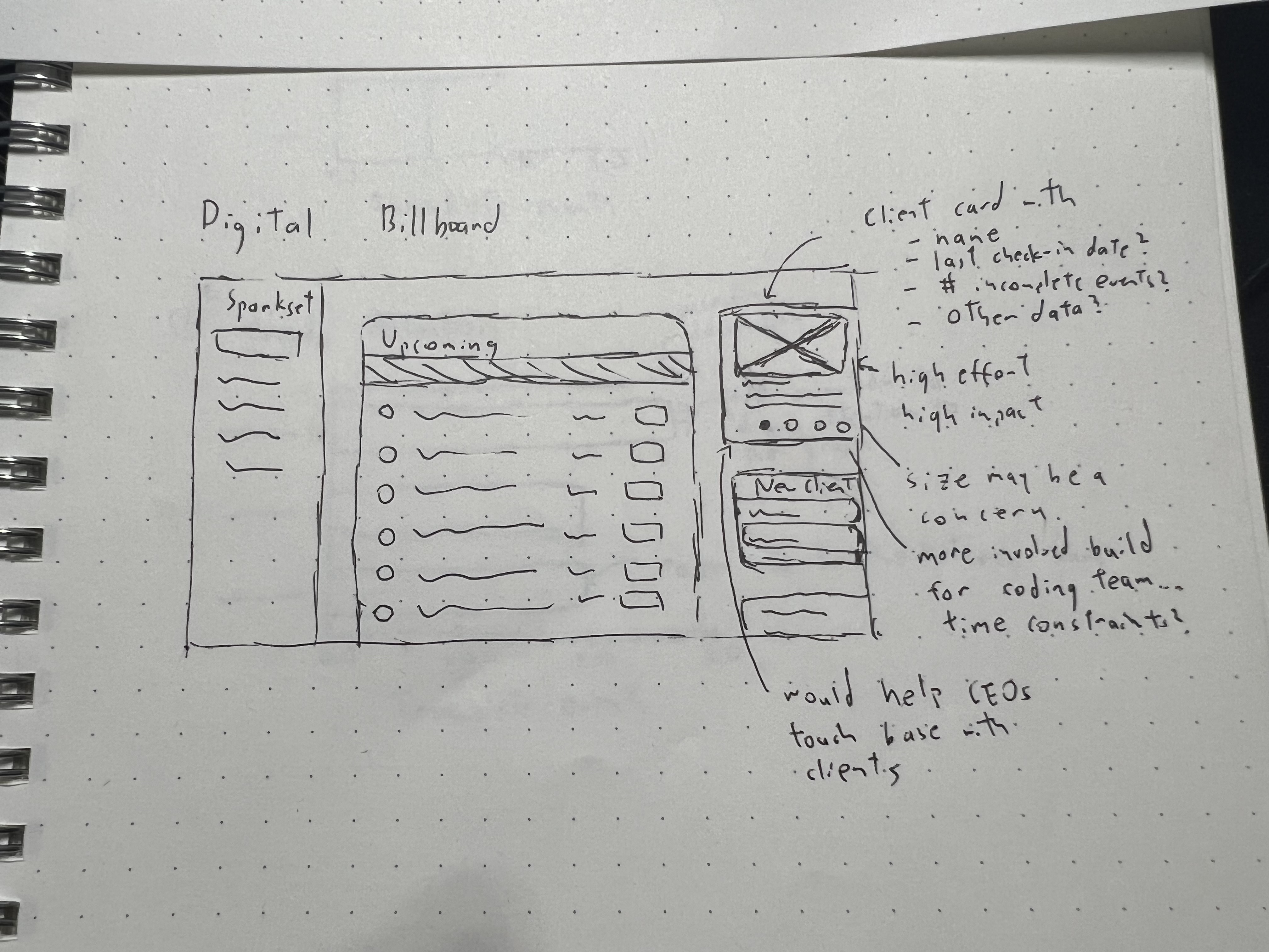
We then created medium-fidelity mockups and discussed the benefits, tradeoffs, and constraints of each solution.
My team selected the "Needs Attention" graph as our solution because it was impactful while still satisfying the time and development constraints that we faced. This feature would list the three clients with the highest number of incomplete events in the upcoming week, along with a corresponding graph showing the number of incomplete events for each client.
X The Sparkset CRM had usability problems and functional issues; both of which added friction to consultant's workflows.
X The CRM lacked key information that would enable consultants to help their clients. These lack of tools frustrated Sparkset employees and drove them away from the system.
✅ The CRM now adheres to recognized usability standards, and the system's key features are fully functional. Consultants can navigate the interface without worrying about usability and functional issues interrupting their work.
✅ The improved overview page provides Sparkset consultants with the tools and data they need to help their clients. With the "Needs Attention" graph, employees have a visual representation of the customers who need the most assistance.
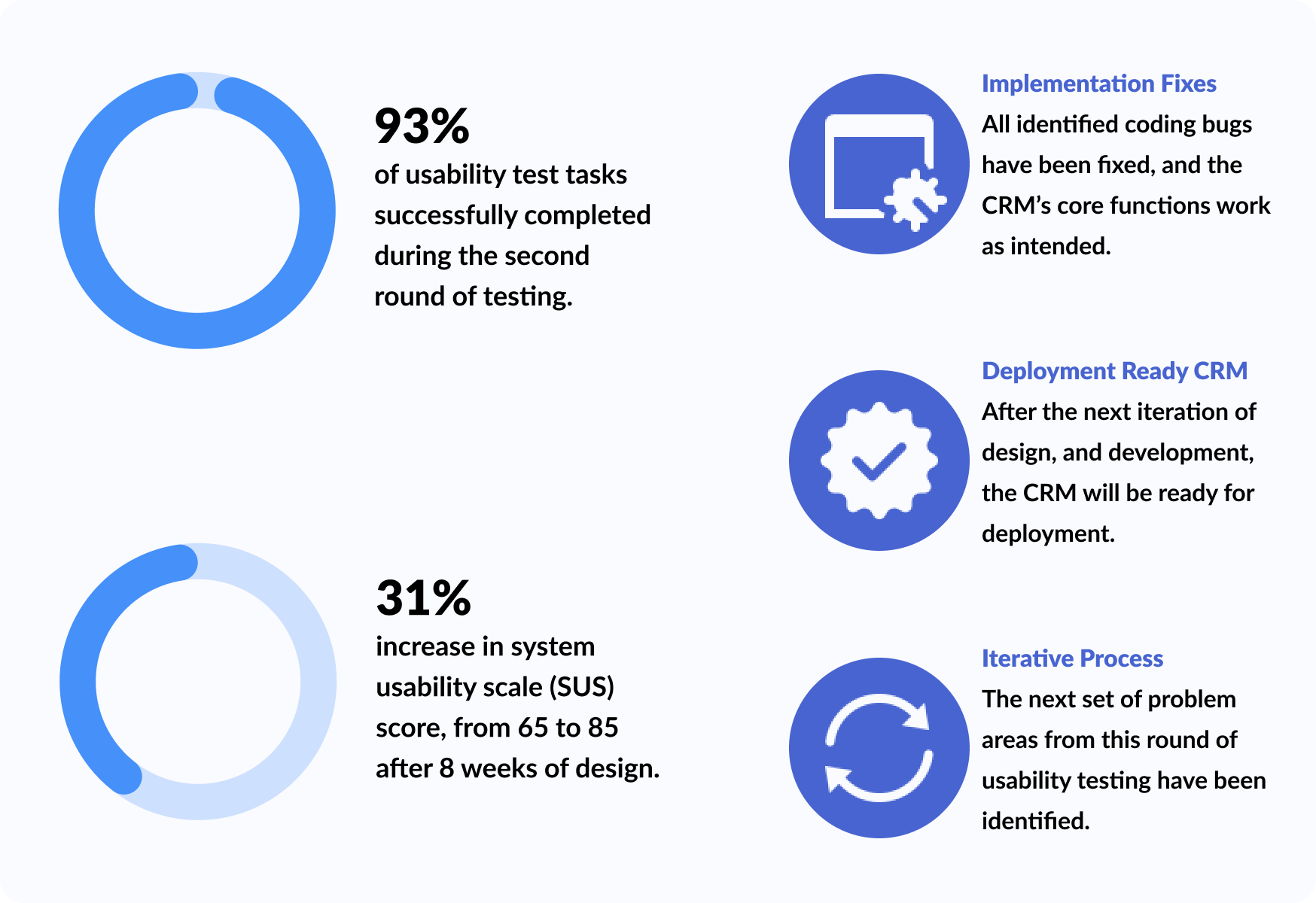
Before shipping our changes to the live site, my team and I conducted usability testing on our prototype to validate our design decisions. A summary of the second round of usability testing can be seen below:
After validating our prototype, my team translated our work from design to code. We used Vue.js as the frontend framework, LeanCloud for web hosting, and ApexCharts for the "Needs Attention" graph.
We then presented the finished product to the Sparkset CEOs and received positive feedback on our methodical approach to eliminating consultants' frustrations with the CRM. A quick demo of the live redesign can be seen here.
I spearheaded the design strategy, user research, usability test, creation of the "Needs Attention" feature, and also coded the usability improvements on the live site.

After showcasing the redesigned Sparkset CRM to Ted and Tiffany, my work with Sparkset has finally come to an end. During the 8-week timeframe, our team was able to perform two iterations of testing, designing, and implementing.
As a result of our work:
This project gave me insight into the world of marketing and the tools consultants use to assist their customers; it was a learning experience to see design’s role within the business management world.
UX improvements won’t always be flashy— and that’s okay
Rapid prototyping should be done early and frequently