
DemocracyLab (DLab in shorthand) is a social impact organization that connects professionals who are willing to donate their time with nonprofits. DLab's website allows project owners (nonprofit leaders) to post opportunities, and prospective volunteers can apply to roles that match their skills and interests.
Design: Jiwon C, Michael H, Tyler M
Development: Peter B, Matt B
Responsive Web
Earlier this year, Mark, DLab's Executive Director, identified a problem where only 30% of volunteer applications were being viewed on the website's project pages. Mark tasked our team with revamping the applicant portal in order to streamline the approval process and increase the number of active volunteers on DLab's platform.
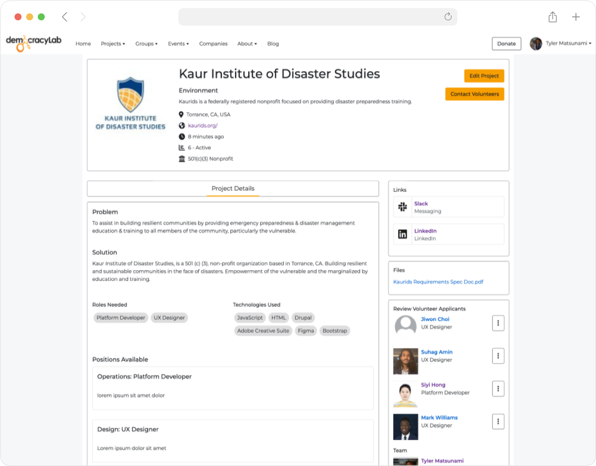
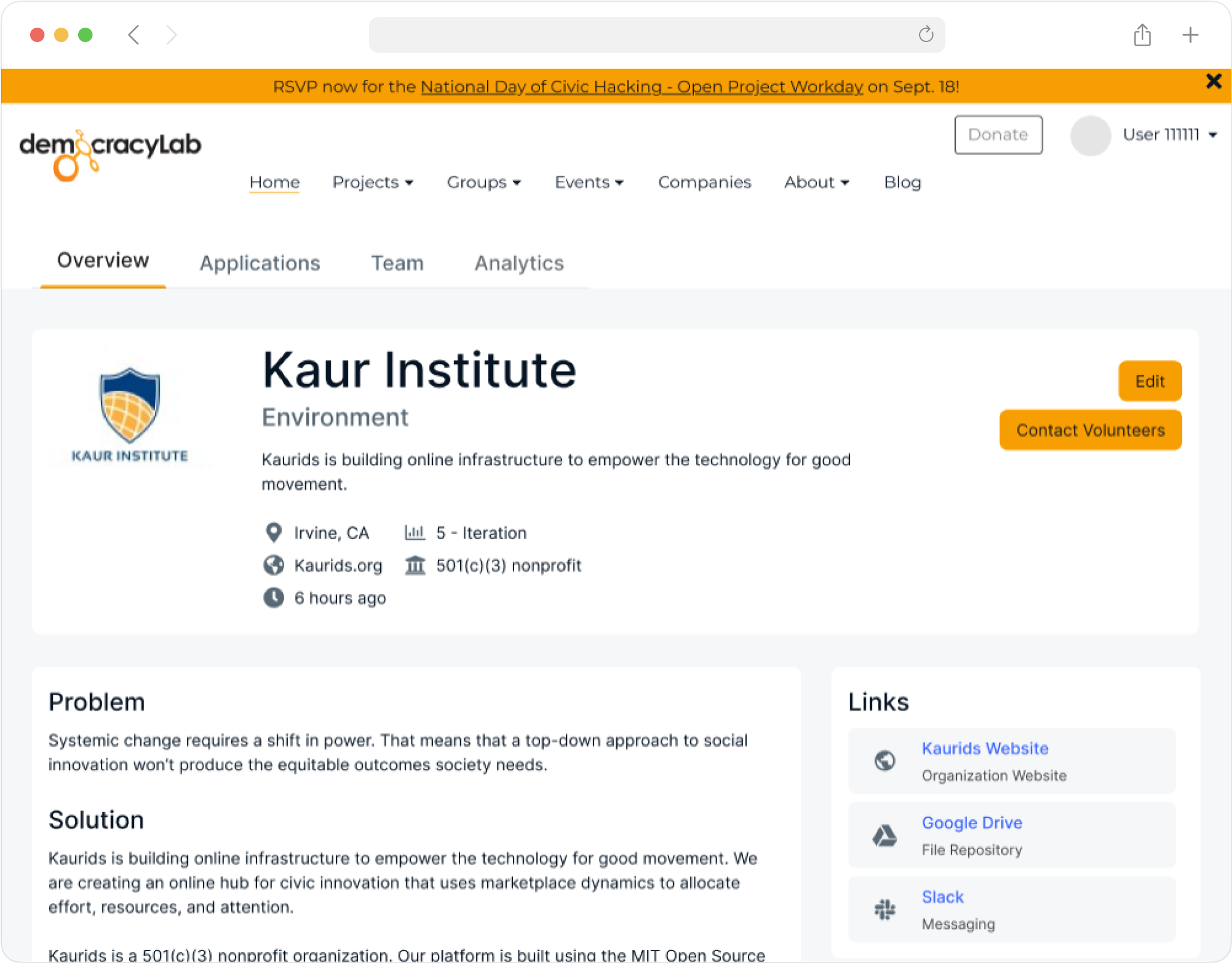
Old DemocracyLab project page (Project Owner View)
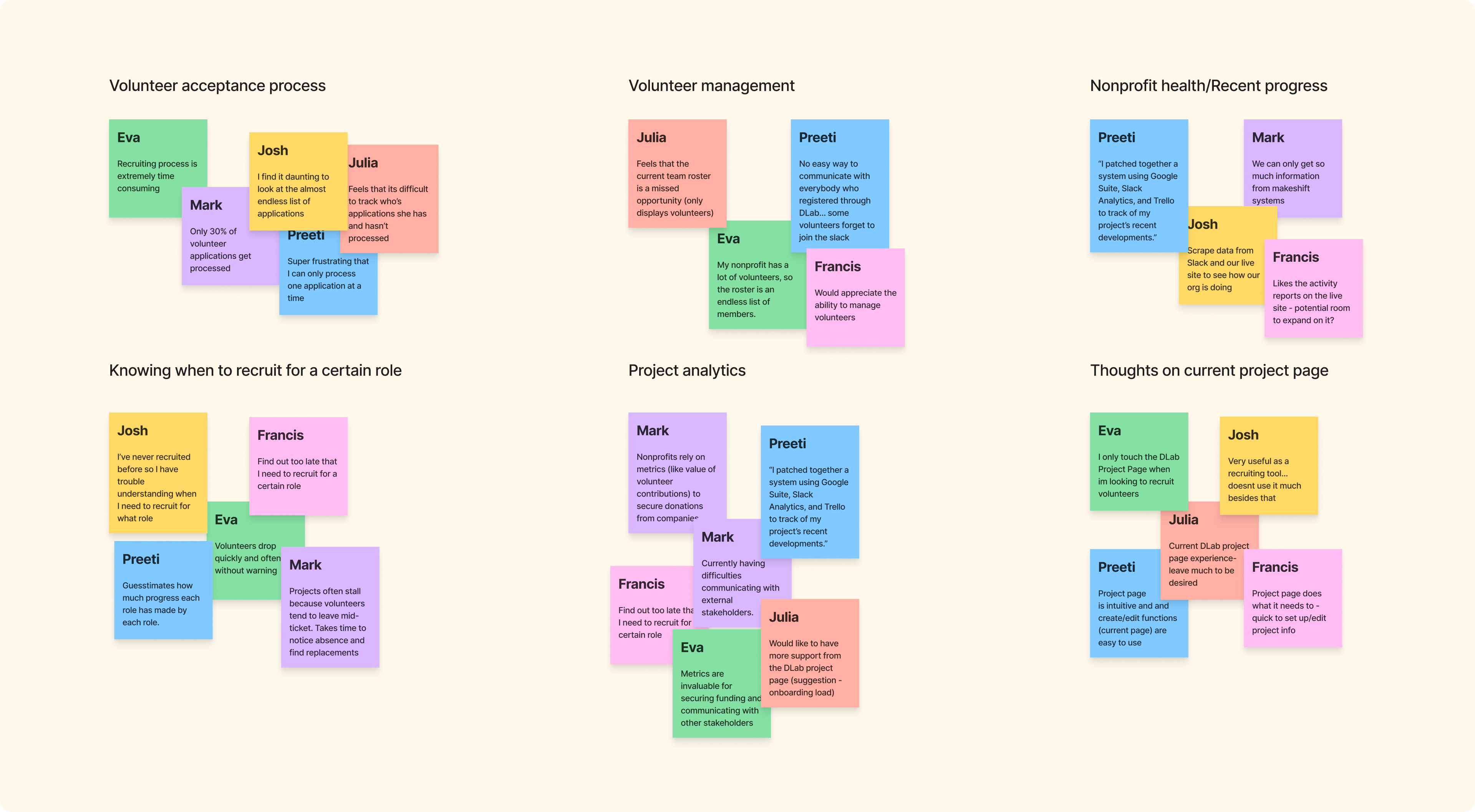
Naturally, the question we want to ask as designers is "Are we solving the right problem?", so we conducted user interviews with 12 project owners on DLab. From these conversations, we discovered that while Mark was on the right track, the clumsy applicant portal was just one of many challenges facing project owners.
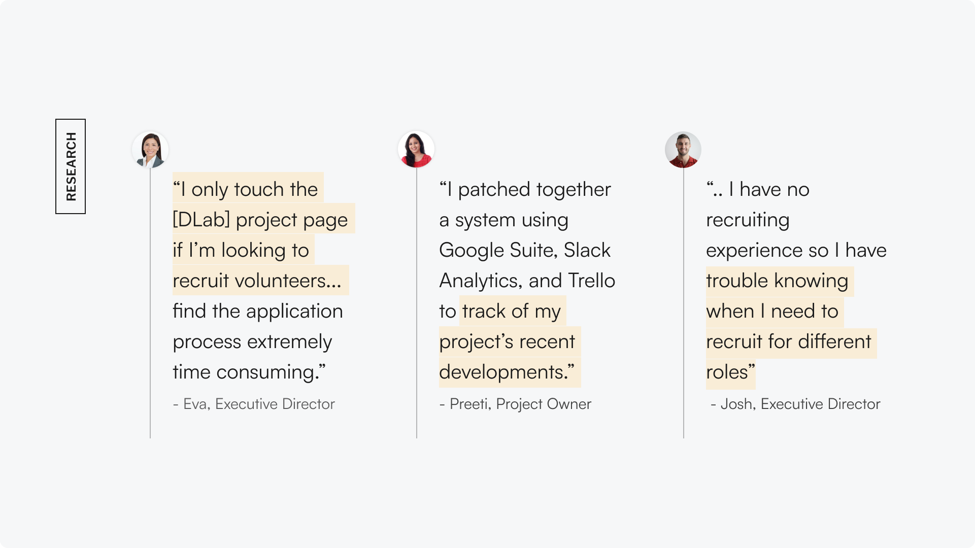
Insights from the user interviews
We were able to identify 3 themes from our discussions with project owners:
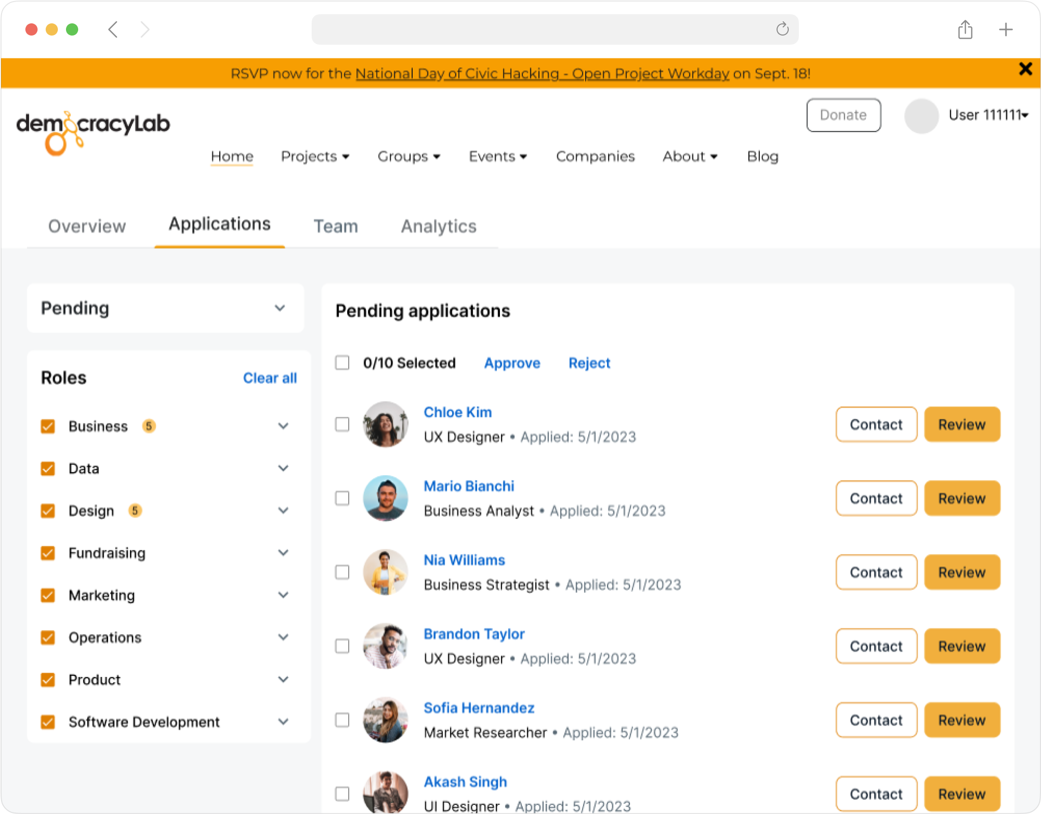
Nonprofit executives found the applicant portal on the project page to be cumbersome.
Project owners need a timeline of recent progress, as non-technical project owners struggled to keep up with recent developments.
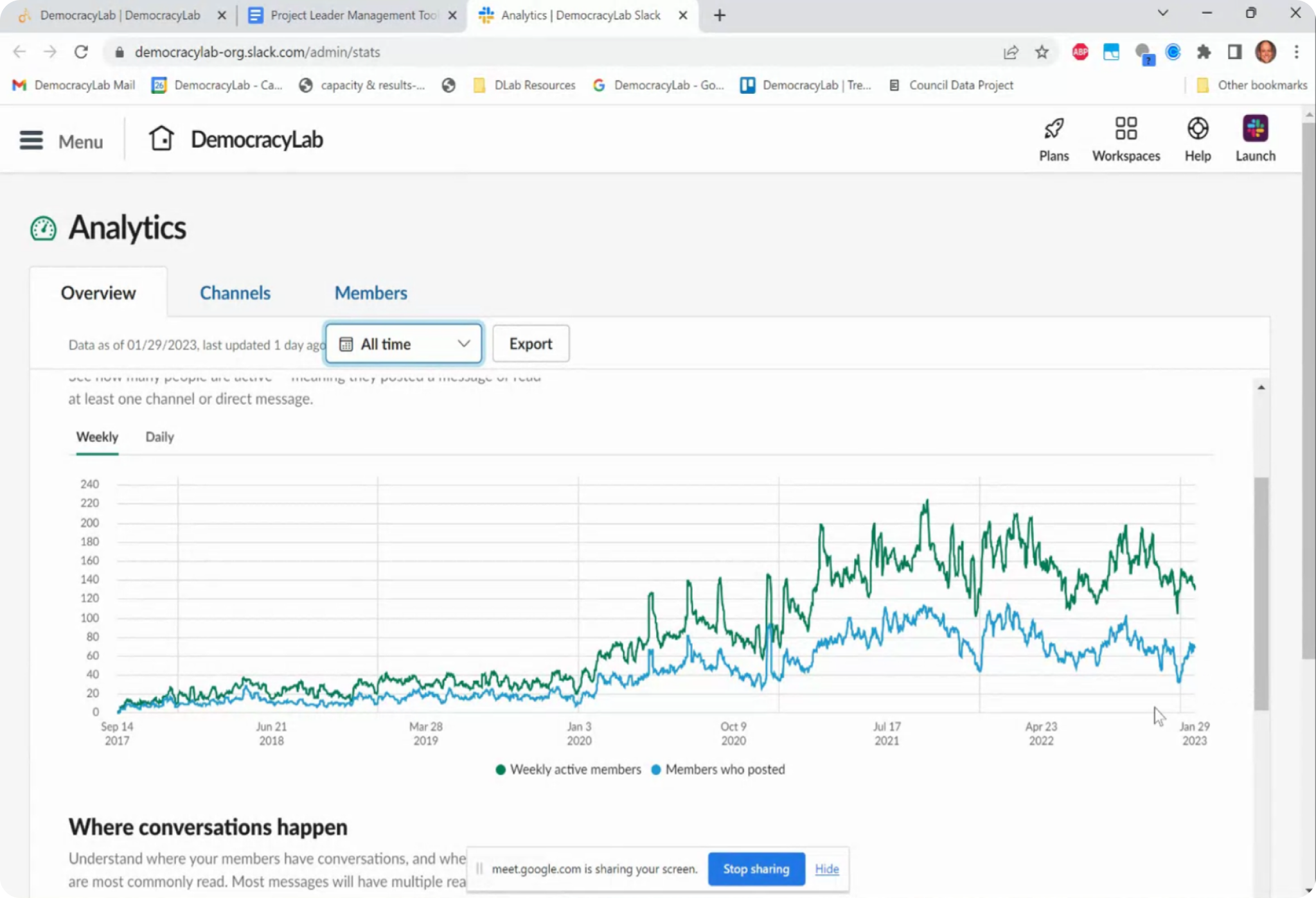
Nonprofit leaders patched together (ie: Slack analytics) to source project metrics. This data is vital to secure funding from external stakeholders.
The three issues we discovered in research are significant because they prevents project owners from making informed decisions about their organization. Without access to accurate data, project owners are unable to track their progress, identify areas for improvement, and allocate resources effectively.
In fact, an alarming takeaway from our research was that 58% of our interview participants abandoned the project page after they procured their volunteers.
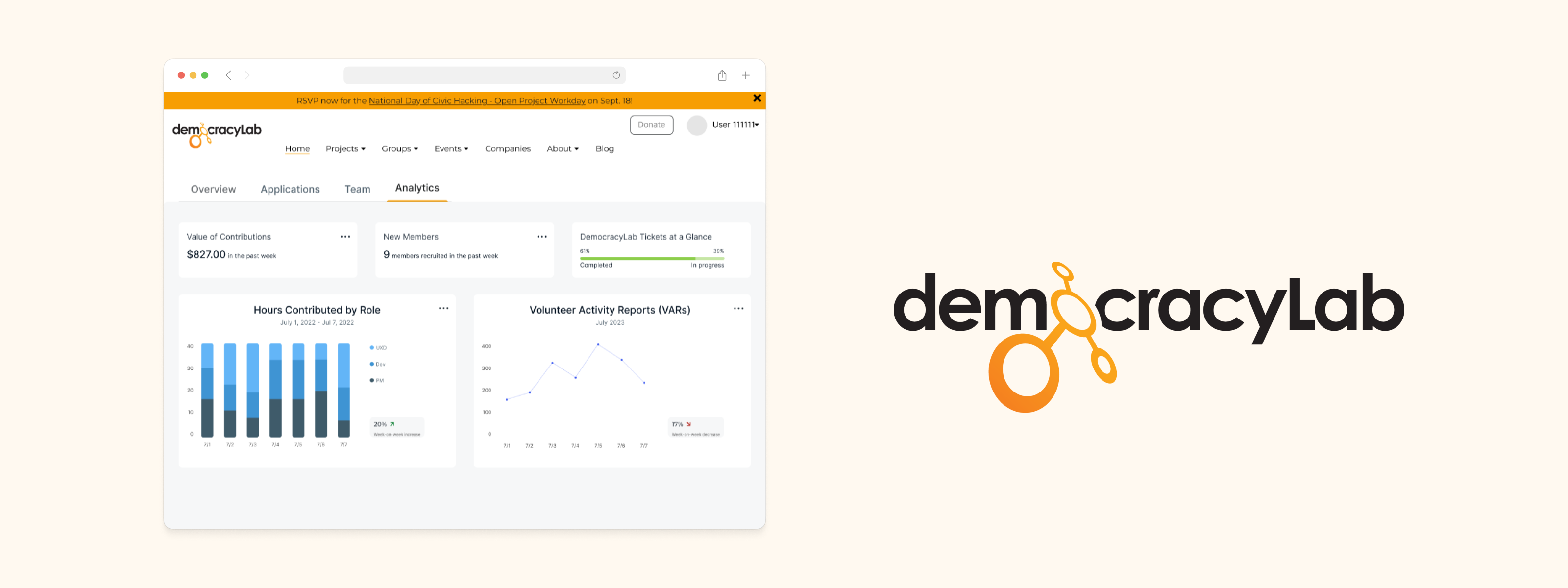
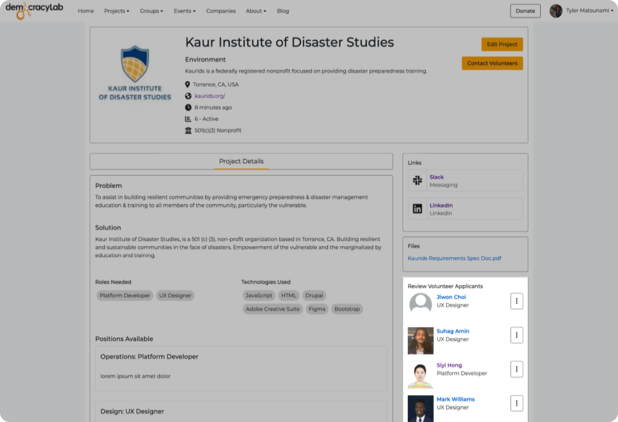
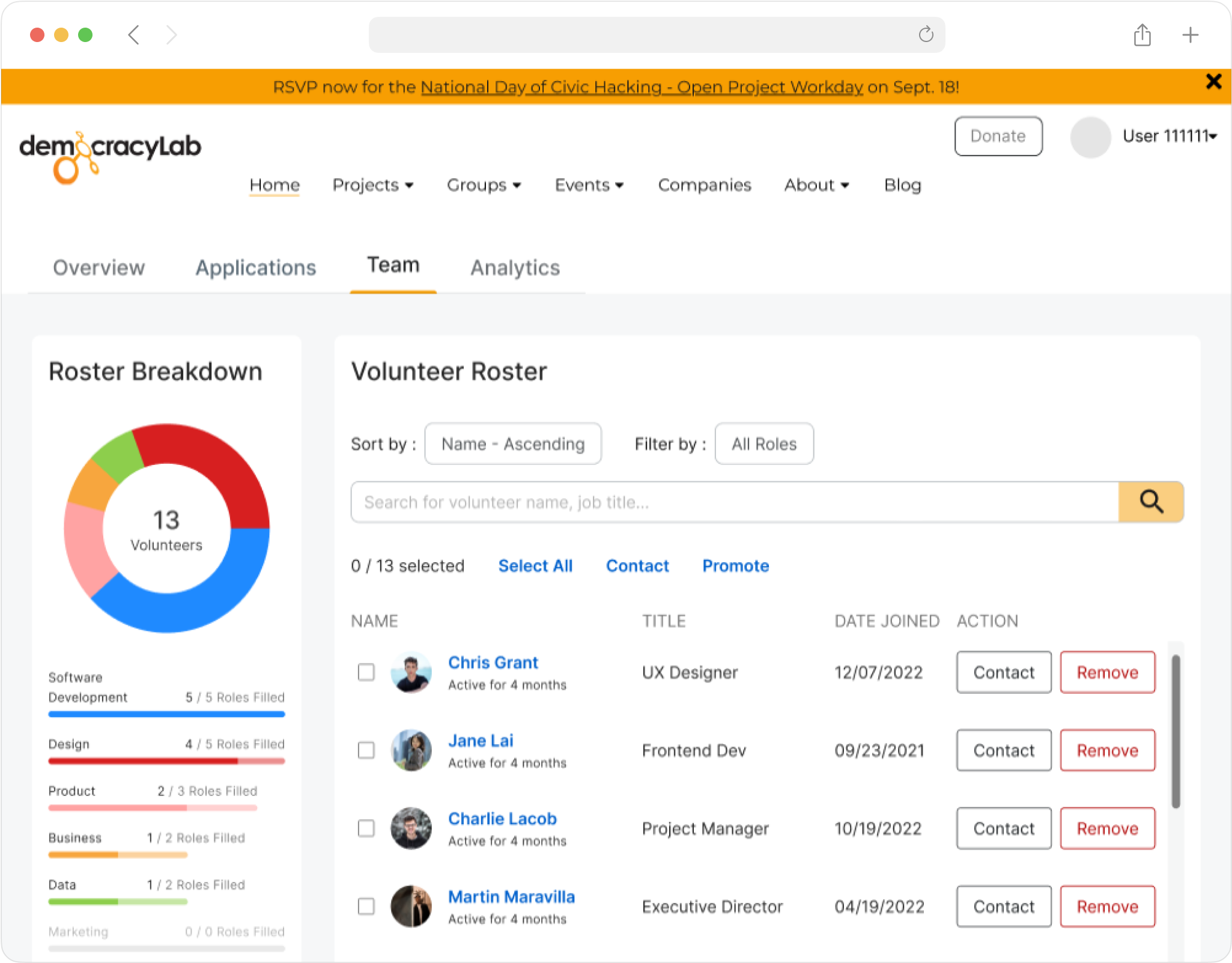
Our goal was to simplify project owners' workflows and provide them with a new project page, called the Project Management Tool (PMT) that includes native support for data tracking and analytics. This tool will allow project owners to streamline the volunteer approval process and give them the insights they need to make informed decisions for their nonprofit.
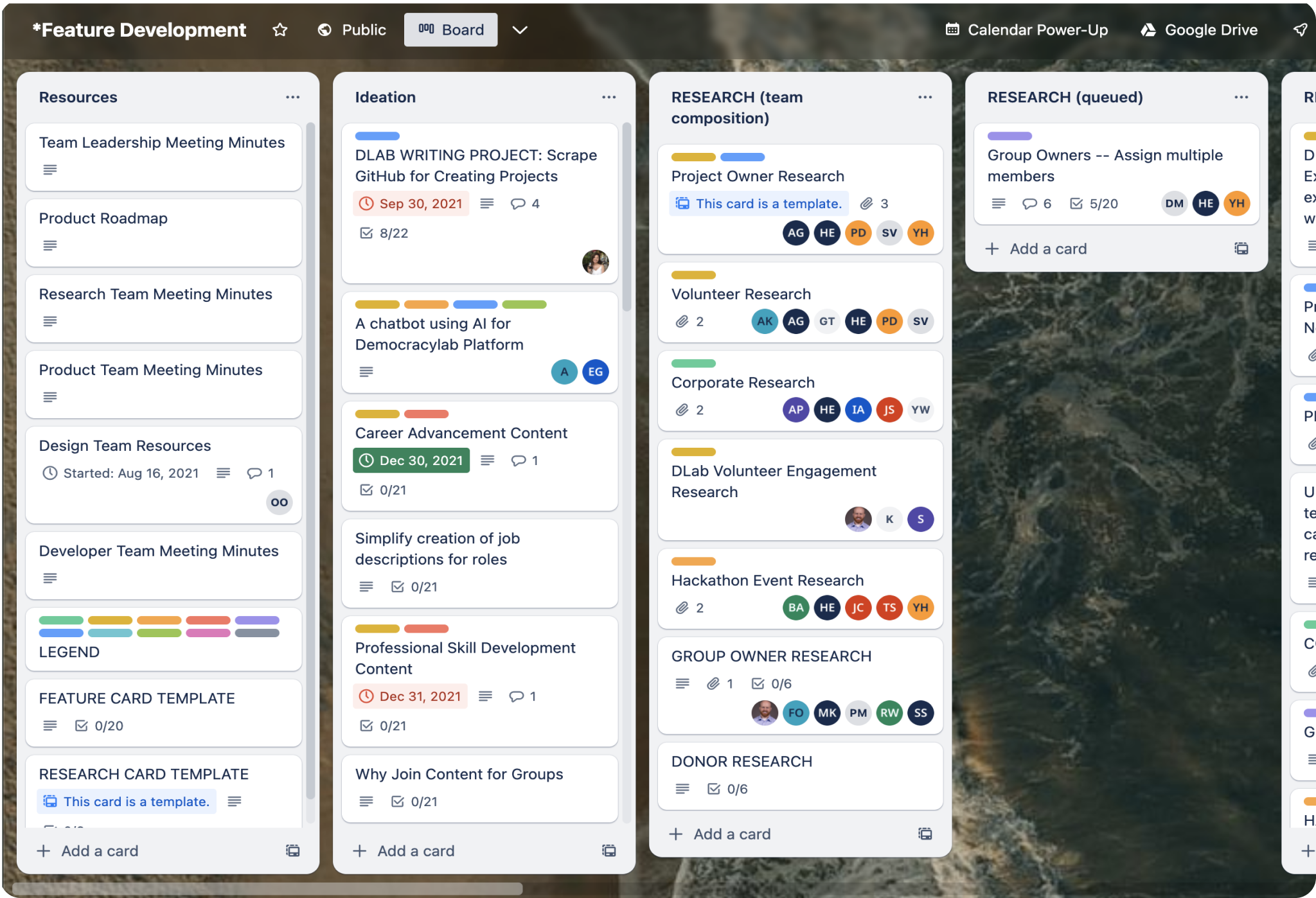
To gain deeper insights, our team employed methods such as affinity mapping and card sorting. I used the learnings from these activities to identify specific areas for improvement and draft together a minimum viable product (MVP) spec sheet that documents the features/actions the PMT should support.
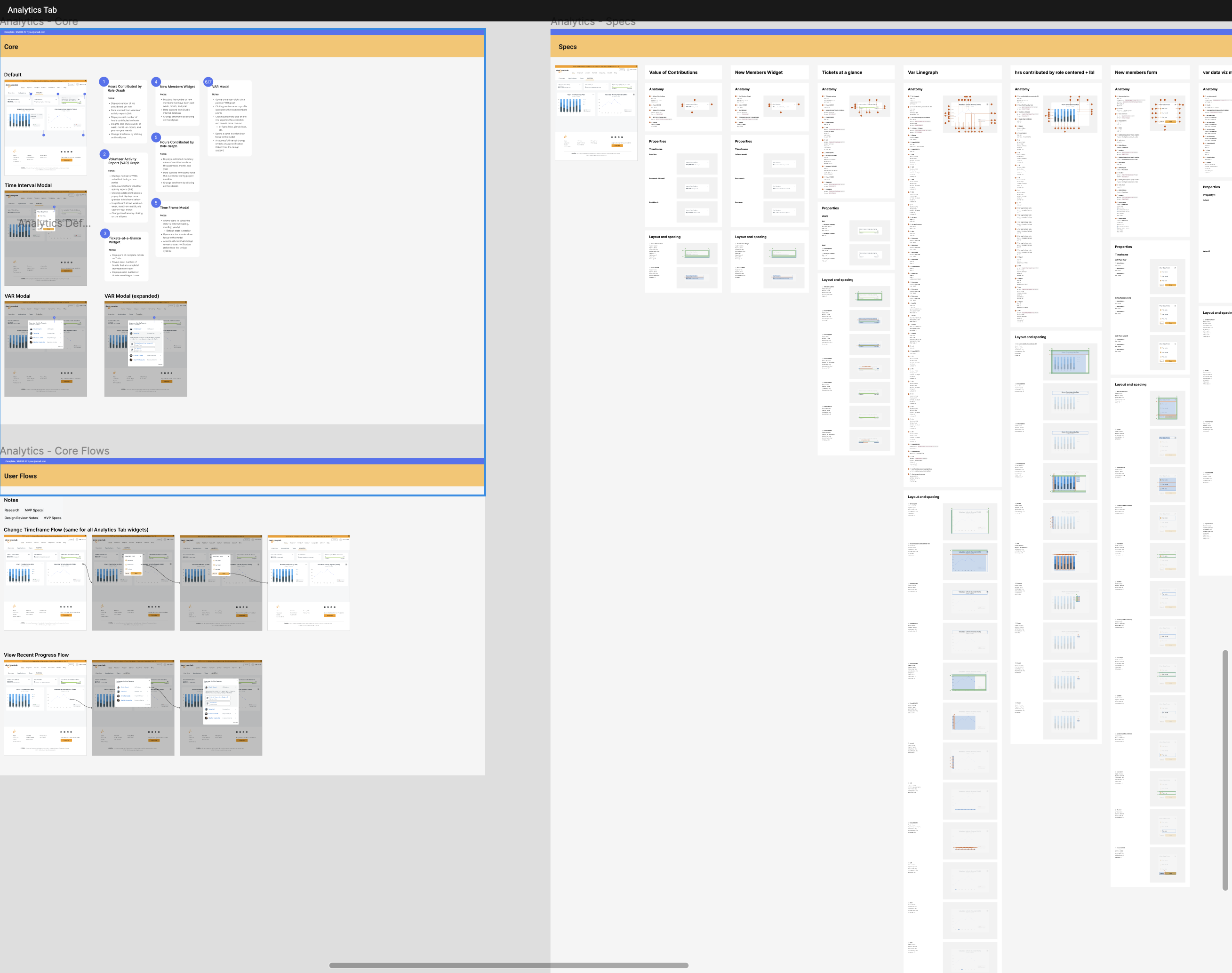
After synthesizing our research and compiling a list of MVP specs, I began to sketch out ideas for the PMT's structure, analytics tab layout, and data visualization methods.
My first brainstorming sessions focused on the different ways we could structure the PMT. We landed on a tab design that allocates a dedicated tab to each flow. This approach enables us to highlight frequently used features on top - something that is not possible with single page designs.
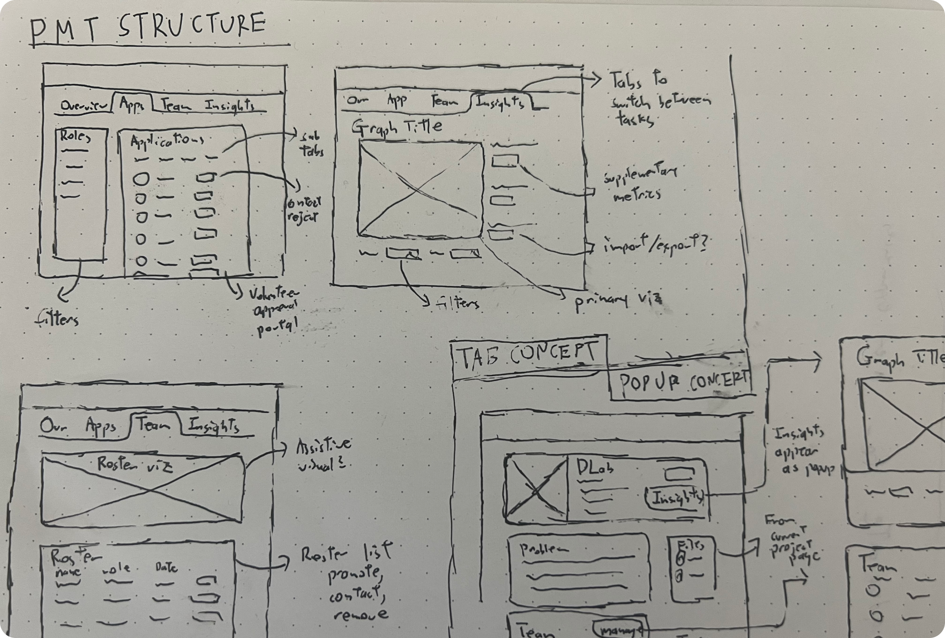
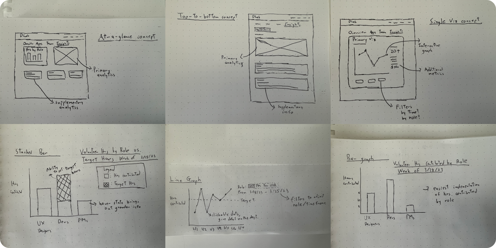
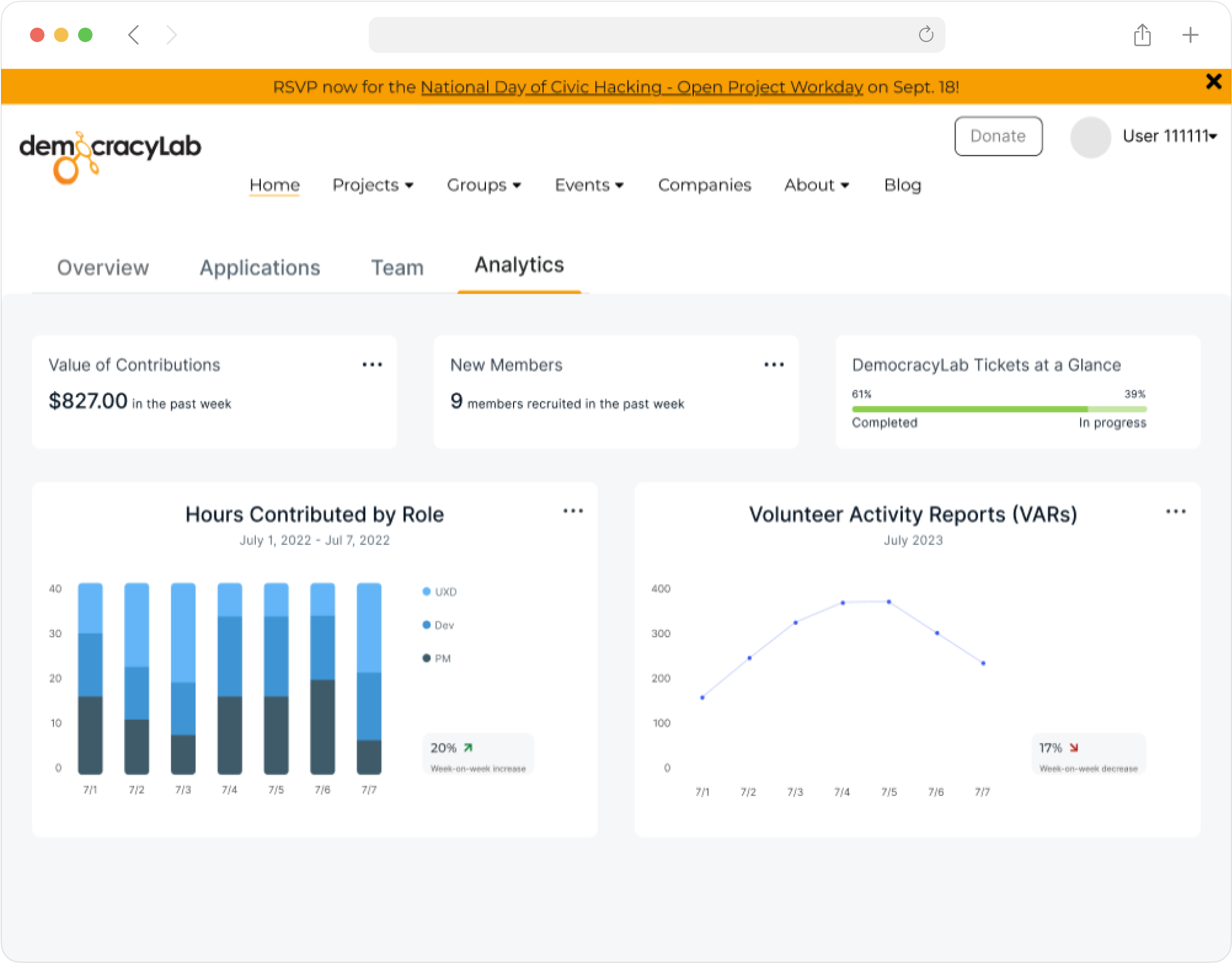
I then ideated different approaches to the Analytics tab and explored different ways I could represent project metrics graphically.
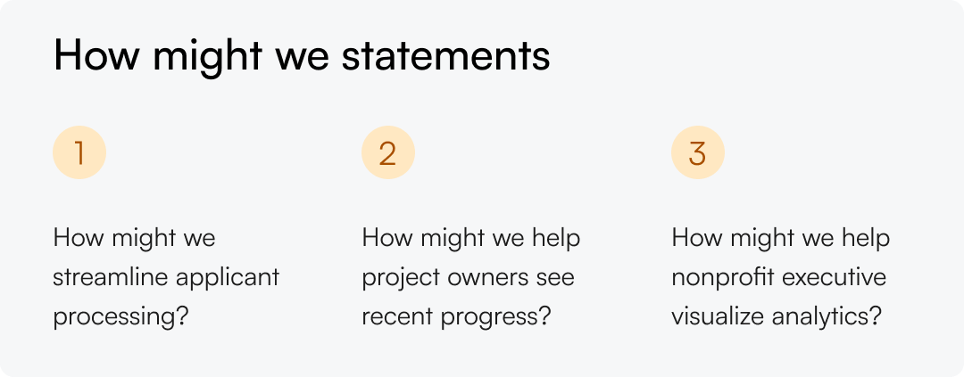
I conducted a second round of interviews to understand the kinds of insights project owners need to make executive decisions. During my conversations with nonprofit executives it became clear that a successful implementation of on Analytics tab should enable project owners to:
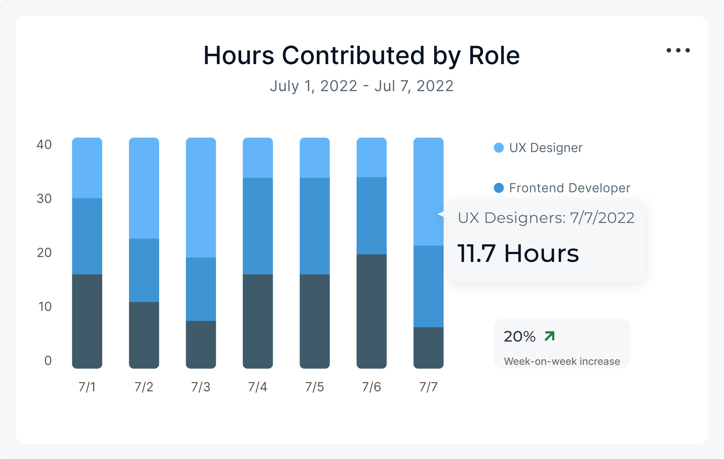
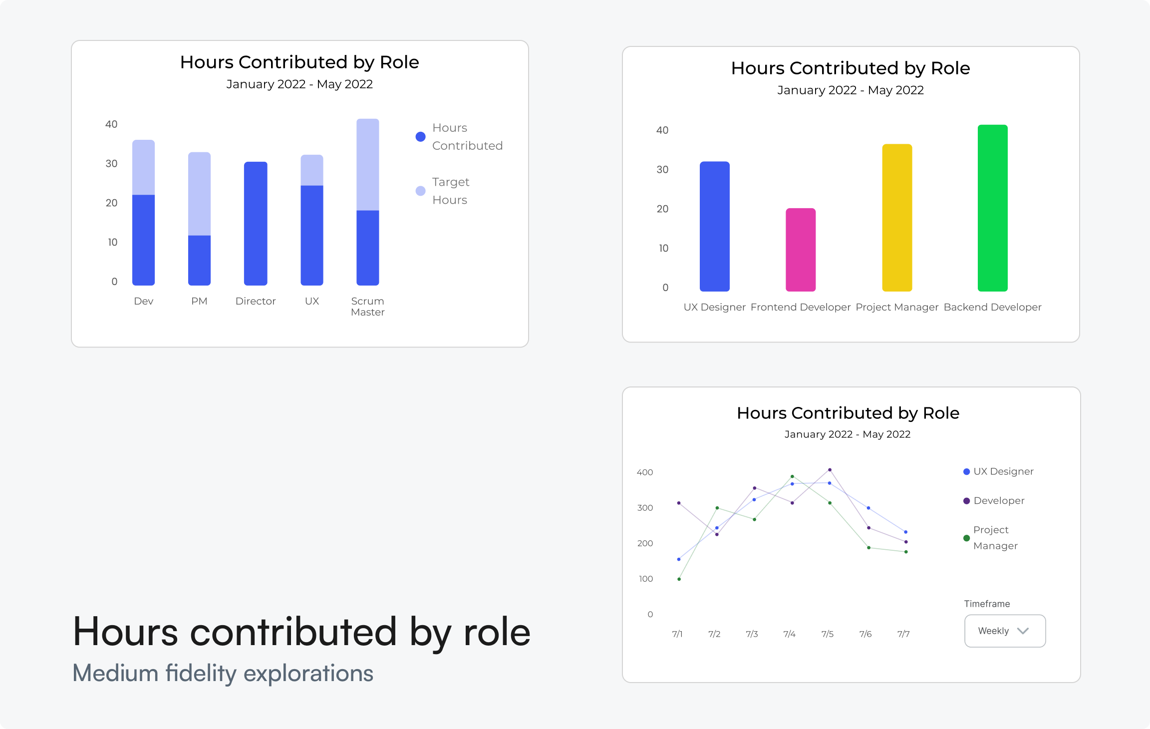
I explored various data visualization models for the analytics tab to help project owners make staffing decisions. I settled on a stacked bar chart to represent the number of hours contributed by role, because it provides the best at-a-glance breakdown of contributions by role.
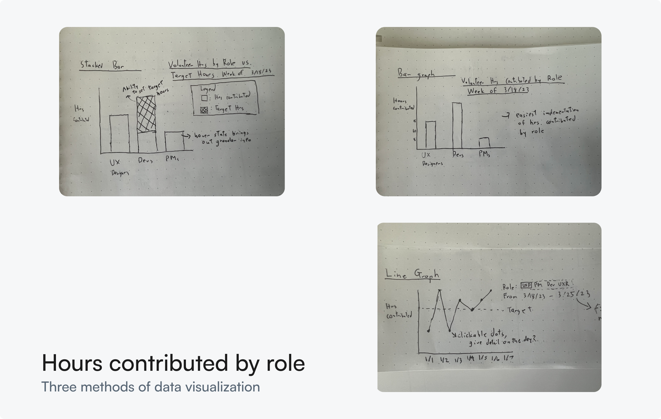
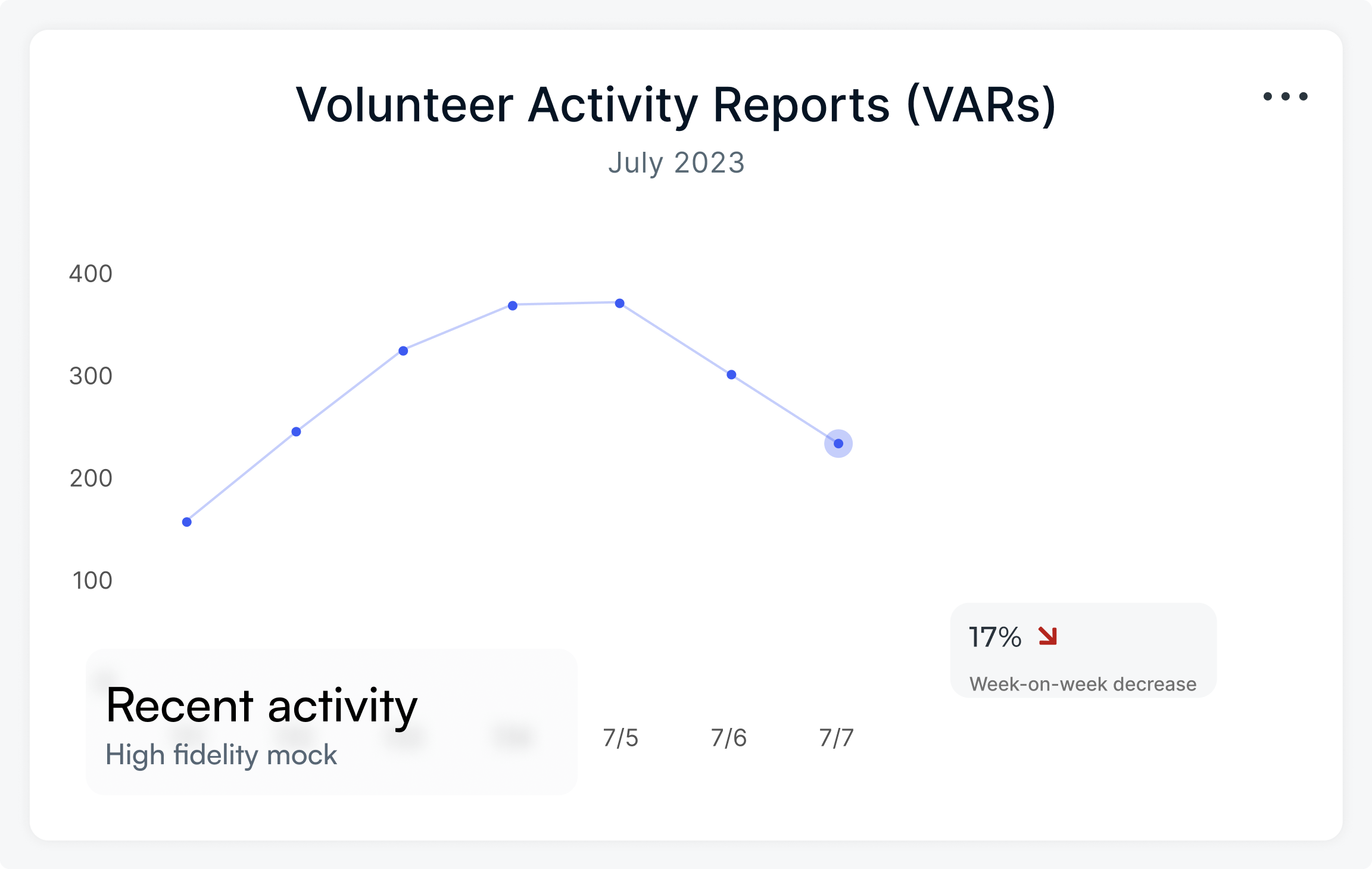
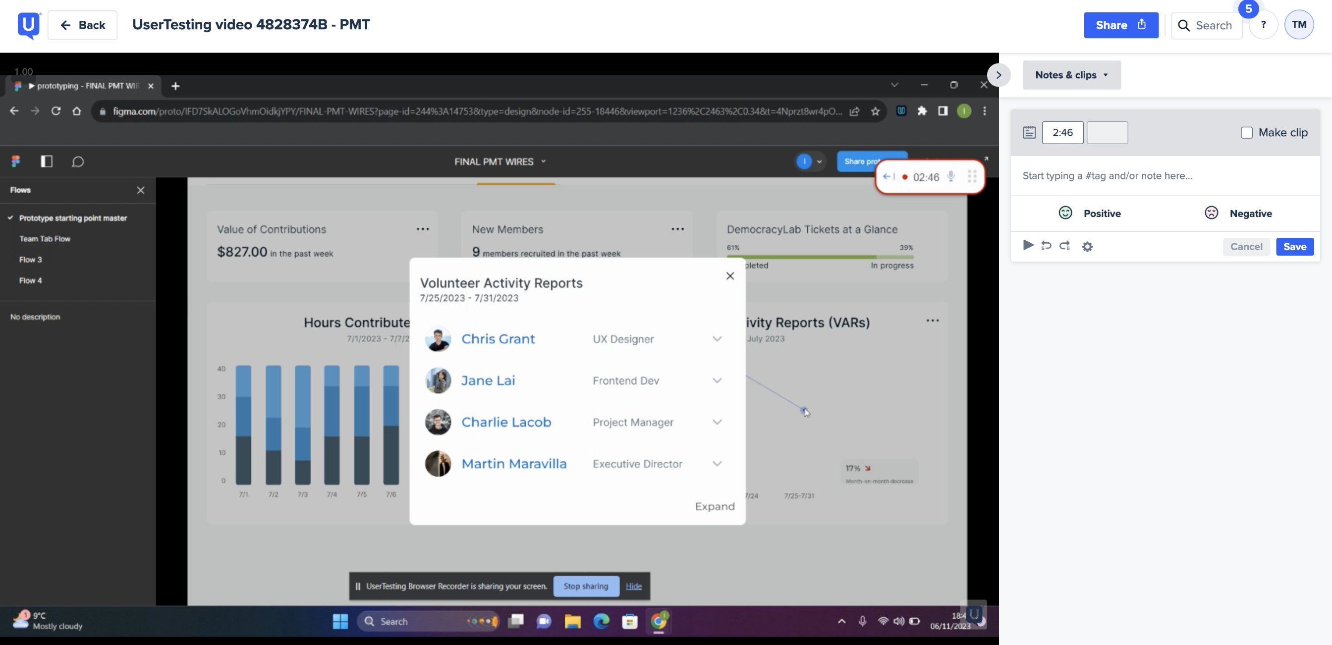
The volunteer activity report (VAR) graph provides a visual representation of recent progress by graphing the number of VARs submitted over time. VARs are an existing feature on DemocracyLab, so reusing this feature reduced load for the developers.
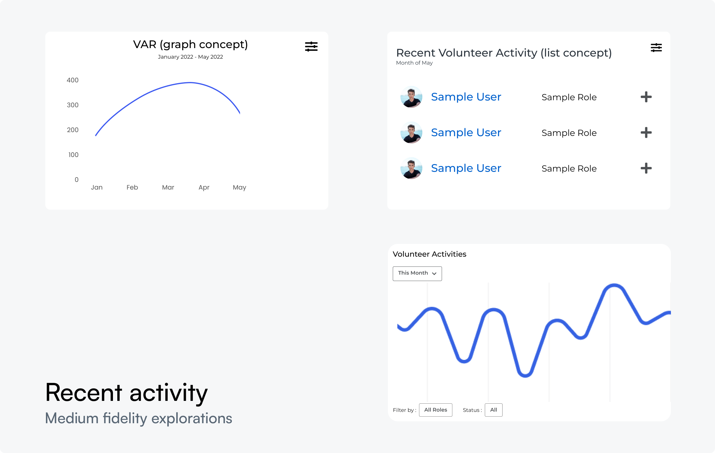
I merged the list view and line graph concepts, enabling project owners to click on each data point for detailed information on recent progress, empowering executive decision-making.
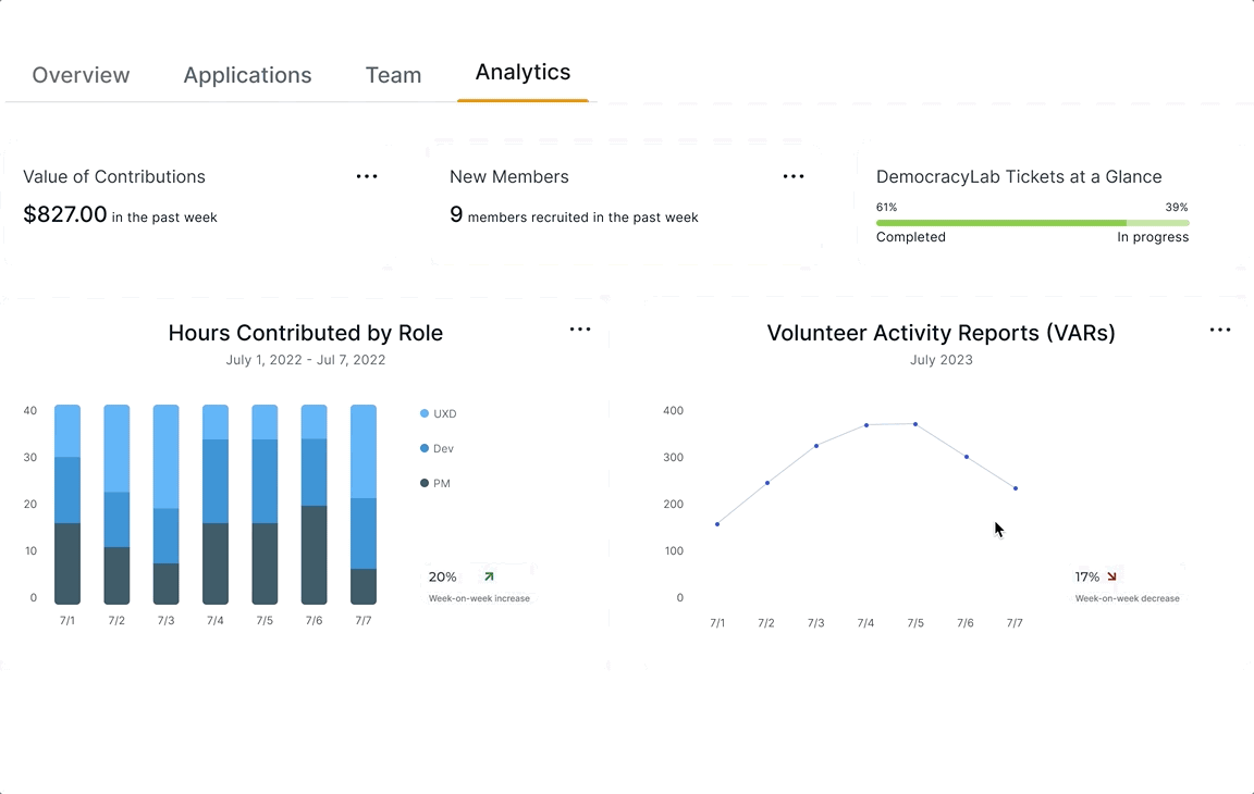
I compiled my design work for the "Hours by Contributed by Role" graph, VAR line graph, and supplementary metrics, and placed them in the Analytics tab. During this stage, I also proposed to revamp DemocracyLab's dated visual design language, as shown below.
With the designs for the Project Management Tool (PMT) finalized, I conducted a comprehensive round of usability testing prior to launch. The testing approach encompassed both unmoderated and moderated sessions. Unmoderated tests ensured that individuals unfamiliar with the PMT could effectively navigate the system, while moderated sessions sought detailed impressions from DLab project owners.
The key takeaway from the testing phase underscored the transformative impact of early and frequent tests. Early testing efforts minimized the necessary changes, rendering this final round of testing more of a confirmation test.
The moderated usability testing sessions with 6 project owners on DLab revealed that project owners were excited for the expanded functionality that the PMT offers. They were able to navigate the interface relatively seamlessly, but stressed the importance of adding friction to certain actions. This led to some minor changes on the PMT's interactions, particularly on the Applications tab.
“I thought the analytics tab was cleverly designed. Having all the data in one spot saves me time.” - Seamus
"... I also like the new additions to applicant and team management, but keep in mind that there are time you want to add friction to your interactions. Fixing those smaller issues should put [the PMT] in a good spot." -David
The UserTesting sessions revealed an 82.5 System Usability Scale (SUS) score, reflecting a high level of user satisfaction. A notable quote from Seamus, a project owner, emphasized the clever design of the analytics tab and expressed appreciation for new features in applicant and team management.
While we were in close contact with the development team throughout the entire process, I wanted to compile a formalized handoff document detailing visual and interaction specifications. The PMT also used many components that already exist in DLab's design system, so the developers were familiar with many of the components that were used the build the PMT. This handoff doc served as a source of truth, and ensured a seamless transition from design to development.
With the handoff process complete, we were able to successfully launch the Project Management Tool! (demo link)
Approximately one month after launch, the engineers came back with data on the MVP’s performance. The results were a success— the PMT had
This project introduced me to the world of data visualization and taught me how to communicate product strategy to stakeholders. Reflecting back on the design process, I learned some valuable lessons:
The importance of solving the right problem
This project was meaningful to me because I learned the value of solving and fighting for the for the right problem. If i were to put myself from two years ago in this situation, I would have probably just redesigned the applicant portal to mark’s vision. But I stuck with what I believed was right even though it was more difficult for my team.
Resourcefulness goes a long way
DemocracyLab is a nonprofit with limited resources, so reusing existing features on the DLab website (such as VARs, Trello, and Github integration), allowed us to create an impactful feature without placing heavy strain on the developers.