
Compass, an EdTech organization created under Code for San Francisco, is dedicated to making special education software more accessible. Compass aims to empower teachers and their assistants by providing a technology solution to the challenge of collecting data in special ed classrooms.
Leads: Tyler Matsunami, Miguel Lopez
Designers: Neha Agarwal, Cory Ishii
In January of this year, Compass completed its initial research phase and started designing interfaces. At the time, Compass' three experience design teams were working in silos, each creating their own one-off solutions. This approach had its limitations because it was not a scalable way to design and develop digital products.
Design systems emerged as a way to help designers manage complexity and create better products. They provide a shared design language that fosters faster and more cohesive product development across teams. By adopting design systems, organizations can ensure consistency and efficiency in its design process, enabling teams to work together seamlessly and accelerate product delivery.
As the Compass design teams progressed in their work, it became apparent that they had no guidelines to stay in sync, and that product was not being developed quickly enough to meet the deadlines. These challenges manifested in various ways:
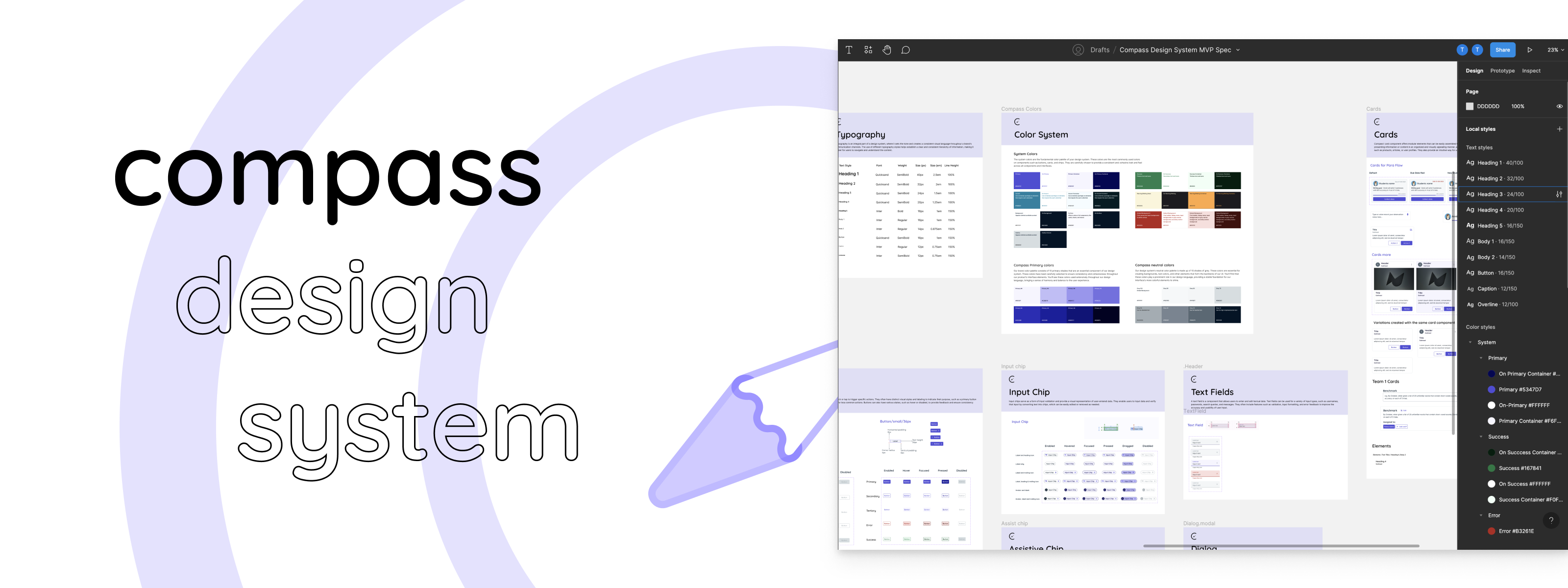
To address the design teams' challenges with slow progress and lack of a unified design language, I assembled a small team of designers and developers to build Compass' foundational design system.
The goal of the design system was to drive greater efficiency and cohesion by establishing a system that document's the platform's visual and experience design principles, and offers a library of reusable elements.
We started by creating a mood board to inspire our visual design direction and understand the industry trends of special education software. From here, we were able to establish some principles to guide our design direction.
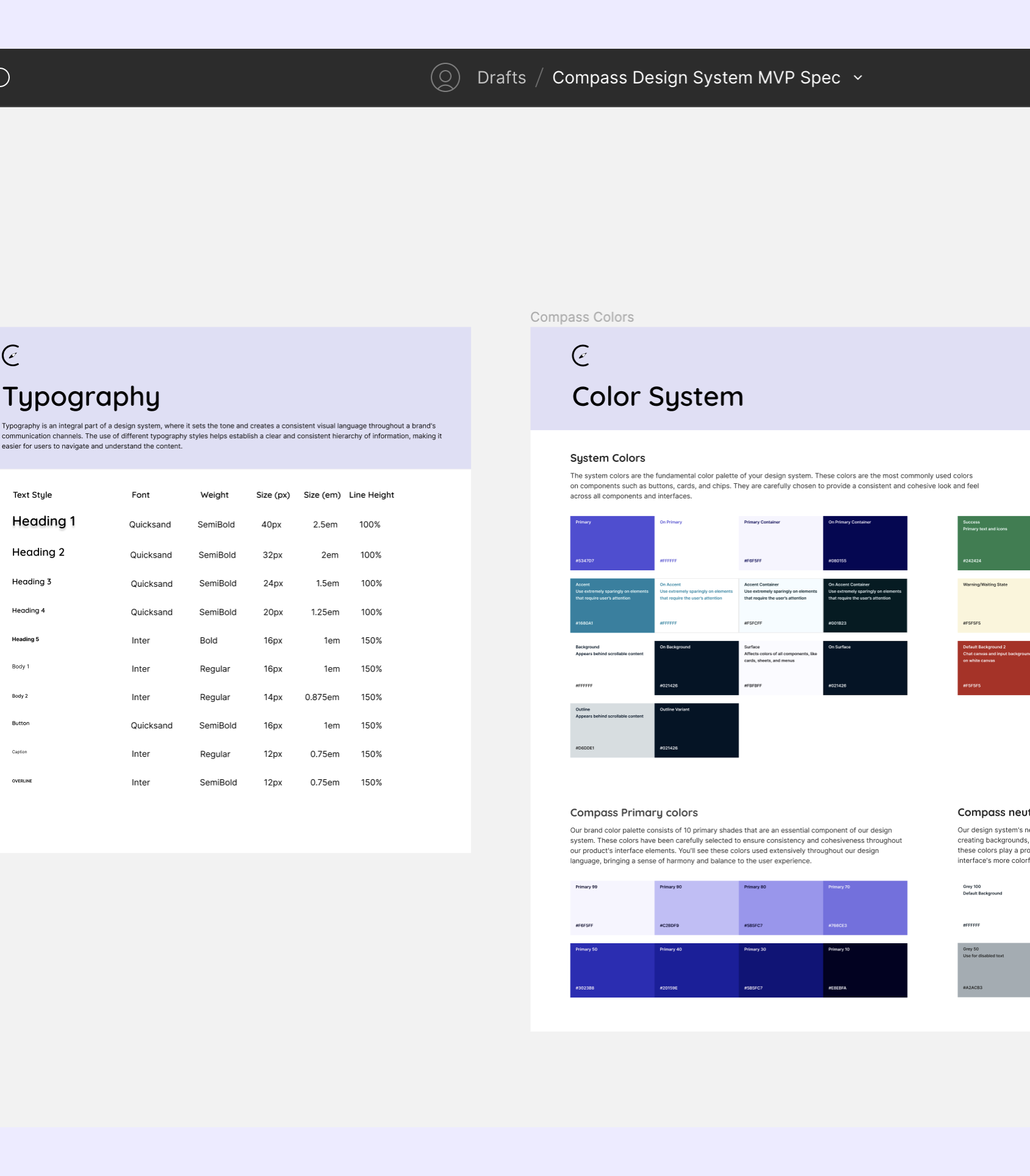
Prior to beginning serious design work, our team developed a style guide that defined the typography, color system, spacing, and icons. These guidelines were essential in helping our designers to create interfaces with a consistent visual presentation and foster a sense of trust in the Compass platform. The style guide also empowered our team to explore ideas within a set of constraints, making it feel like we were all working towards the same idea for the subsequent steps, like making the component library.
For the type scale, we developed a system that defined font families, sizes, weights, and guidelines for mobile and desktop breakpoints.
Our color system adopts a primarily monochromatic palette, and incorporates a vibrant blue-purple to draw attention to critical elements. We also pushed for WCAG 2.0 compliance to ensure accessibility and inclusivity in our designs.
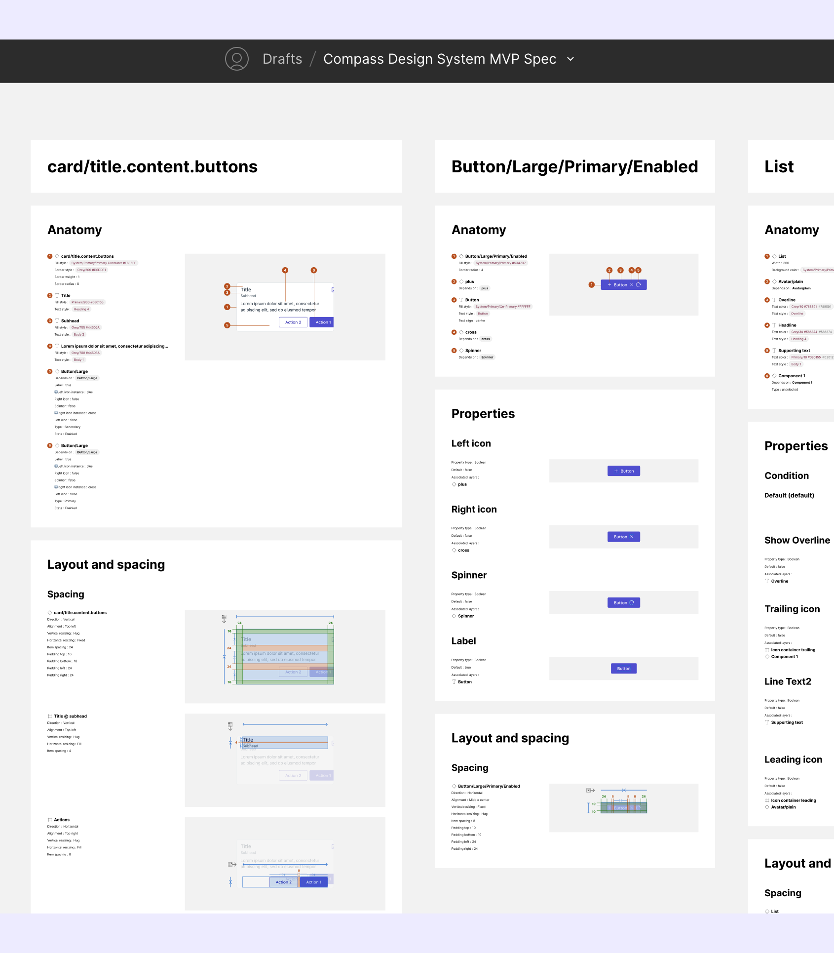
Our team then crafted a set of reusable components in order to streamline the design process. The component library allowed our design teams to focus exclusively on building the user experience, and increased the design teams' outputs by 33%.
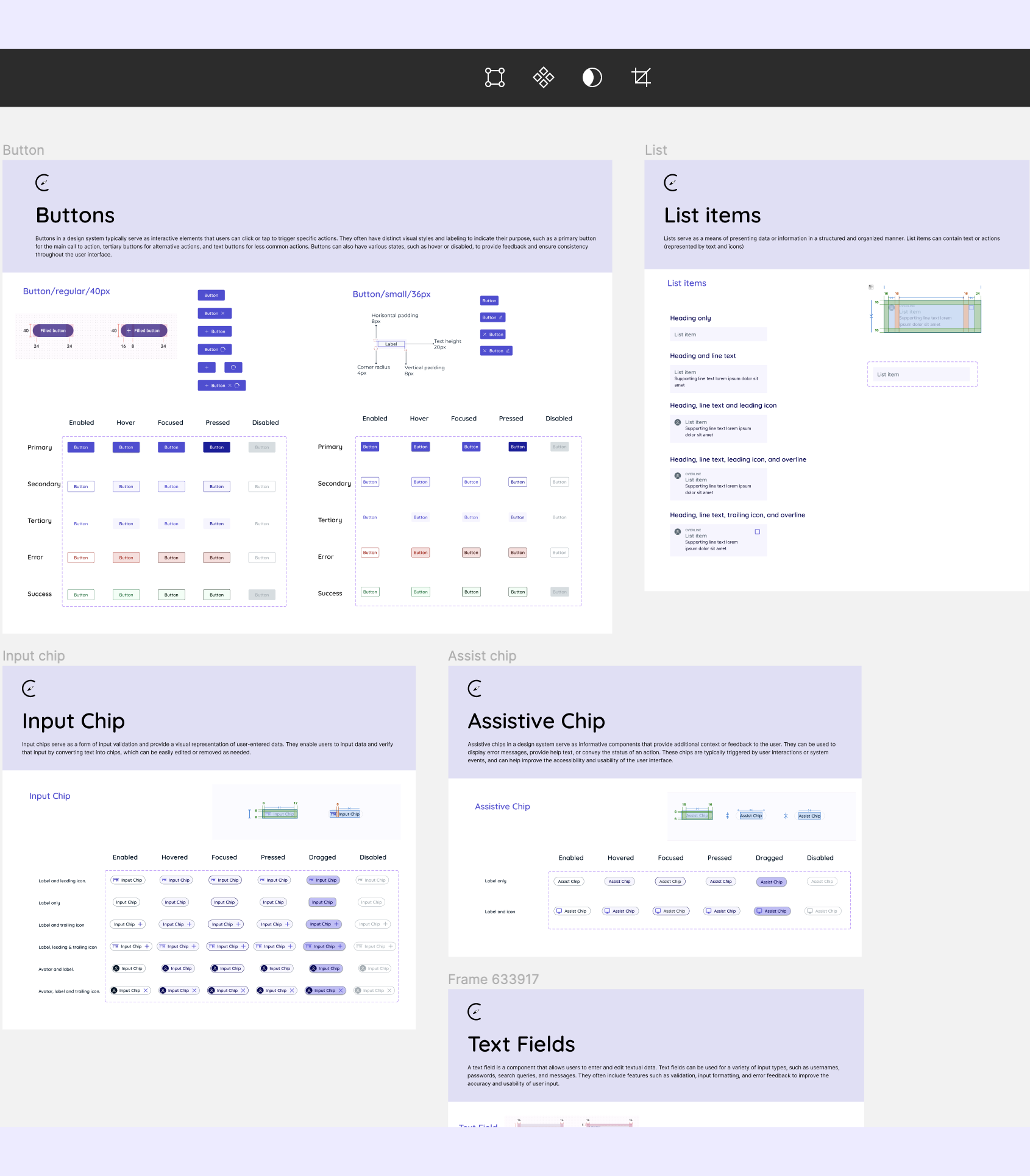
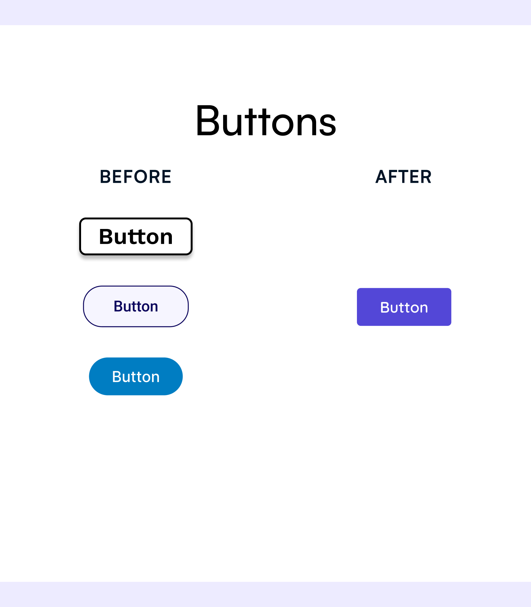
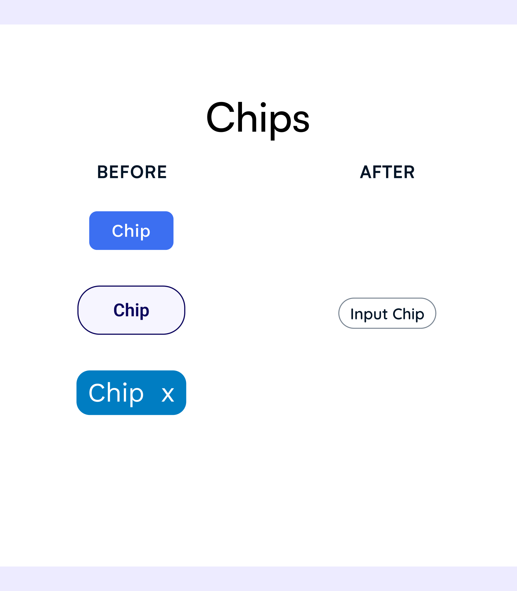
Each component accommodates various actions, sizes, and states, and is given detailed specifications regarding spacing, justification, and touch/pointer target.
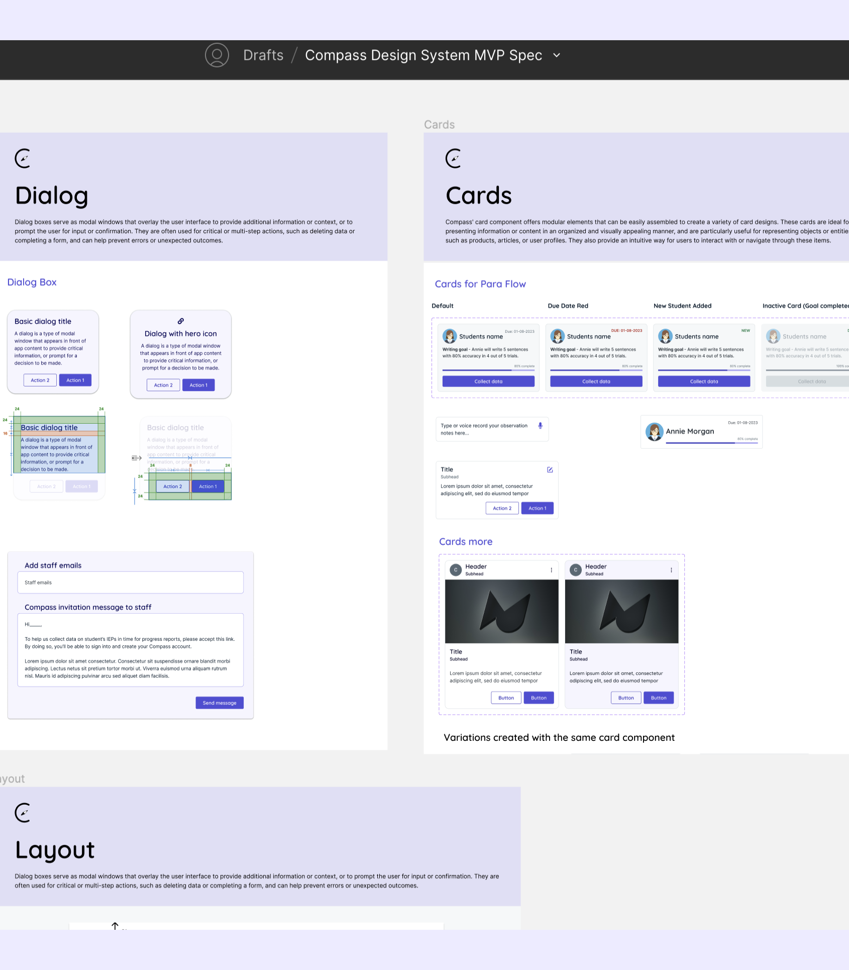
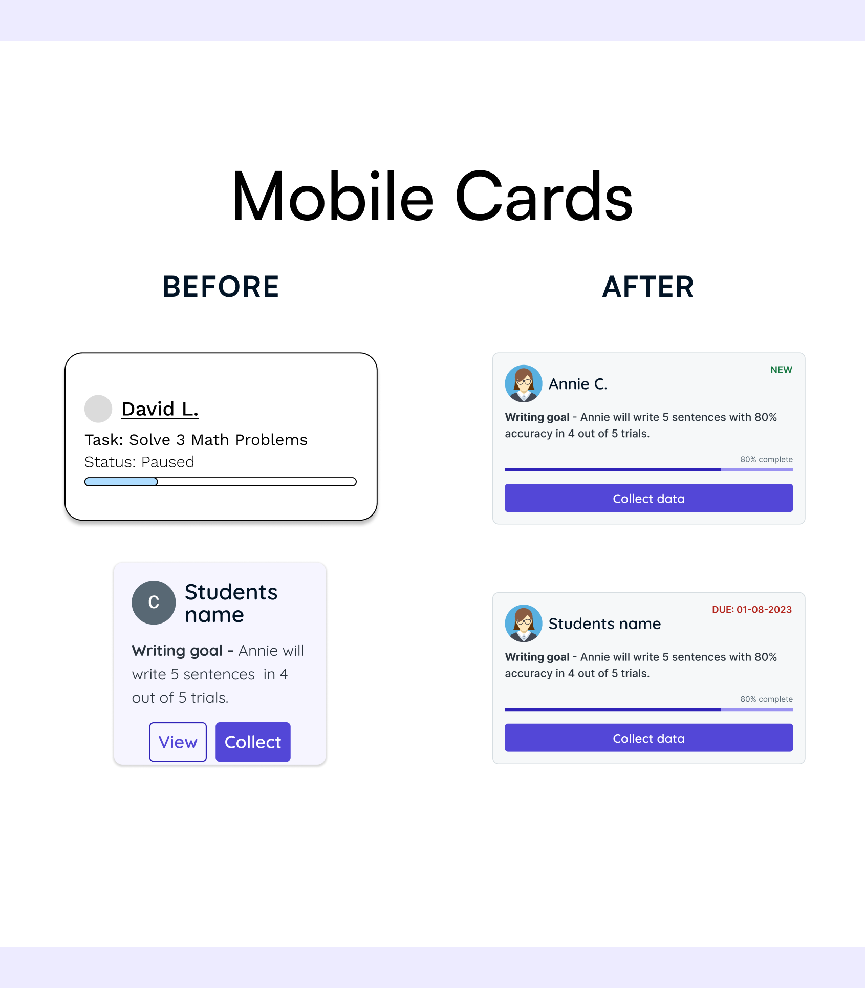
Finally, we combined sets of components into design patterns in order to address common user objectives. These patterns played a crucial role in maintaining a unified user experience across different interfaces and flows.
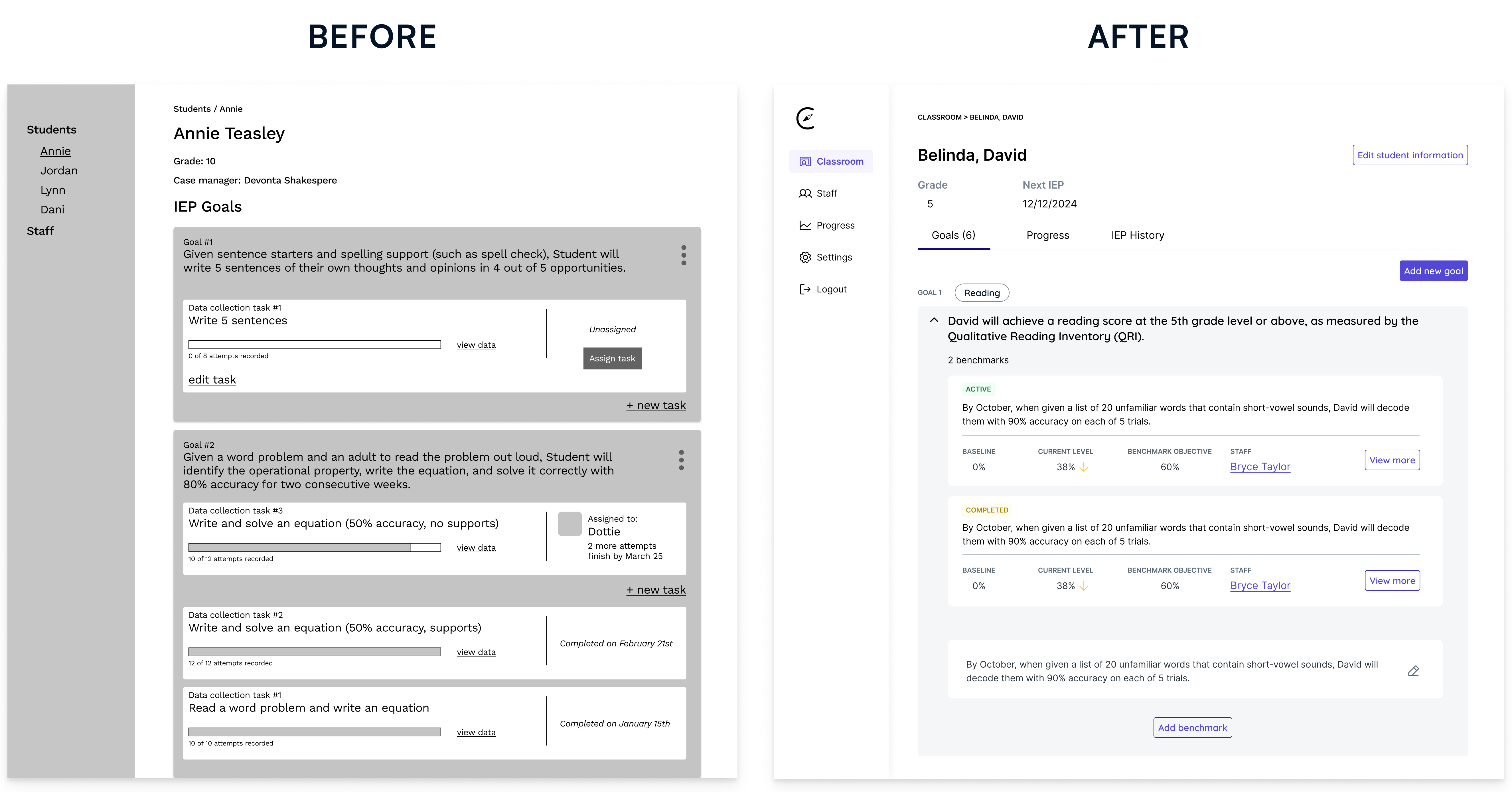
Our design patterns, such as cards, modals, and forms, allow our experience teams to maintain visual and functional consistency across different flows. They serve as starting points for essential teacher and assistant flows, such as student goal creation.
Accessibility was one of the top priorities for the Compass Design System. We discovered that many special education teachers and instructional aides are people with disabilities (including visual impairments) in our user interviews, so we placed great emphasis on making our designs WCAG compliant. As a result, we were able to create an inclusive experience that enables users to seamlessly navigate and interact with our system.
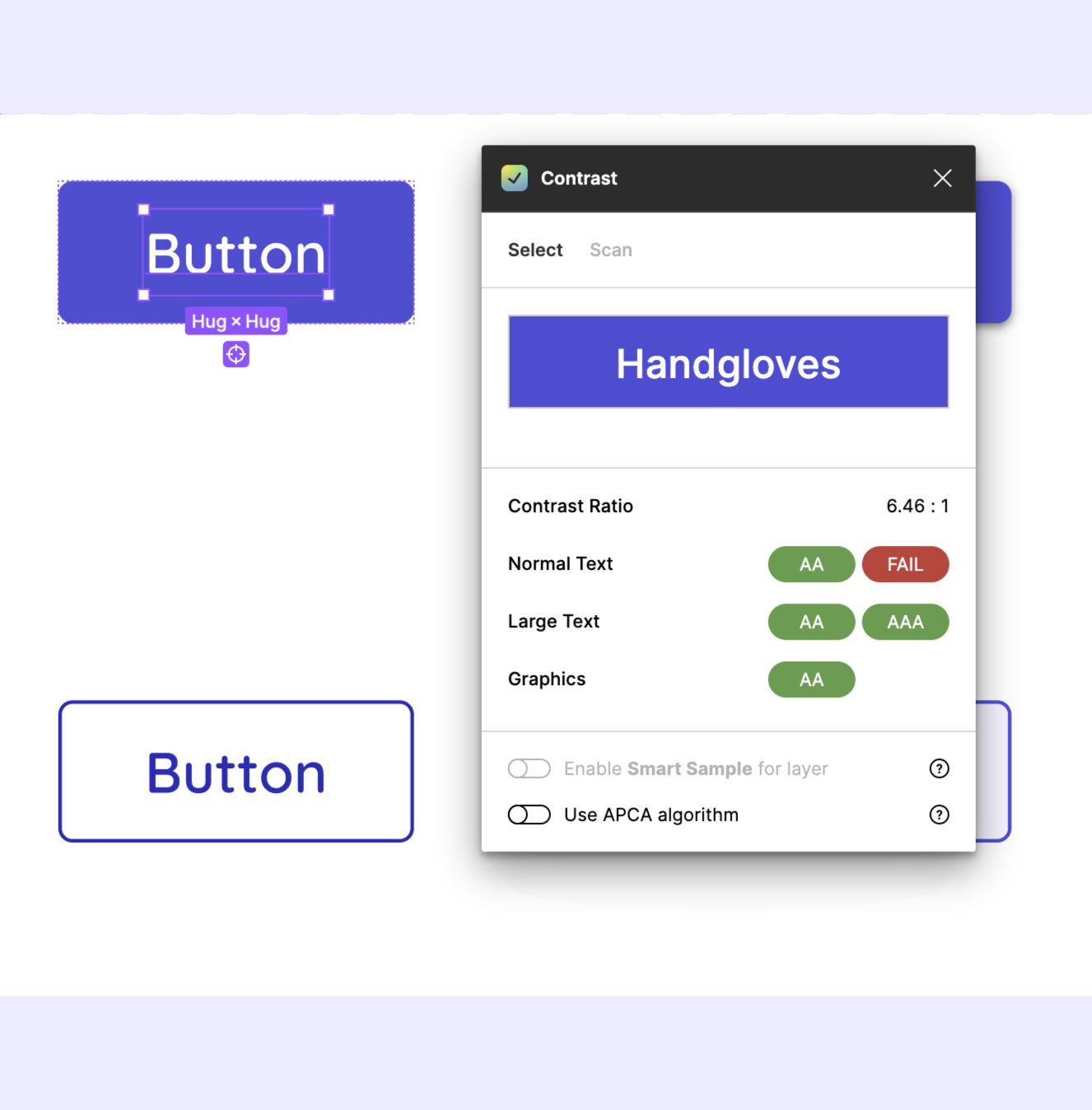
The color system outlines all accessibility considerations and best practices. It specifies that all color combinations should be WCAG compliant, with a minimum contrast ratio of 4.50 between the type's color and its background fill.
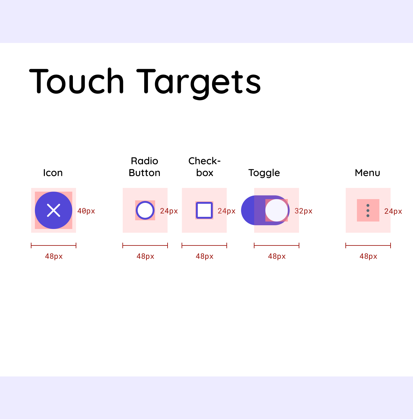
The design system also accounts for users with motor disabilities by calling for larger touch and pointer targets with generous amounts of padding around the interactive element.
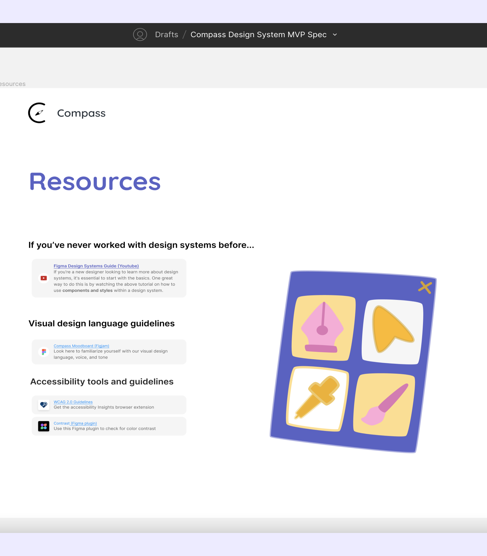
Our team understood that documentation would be crucial to the success of Compass' design system. We worked closely with Compass' director, development teams, and design teams to create a quickstart guide, resources document, and developer specifications.
As a result, designers and developers were able to quickly familiarize themselves with Compass' design language, and utilize the design system components in their work.
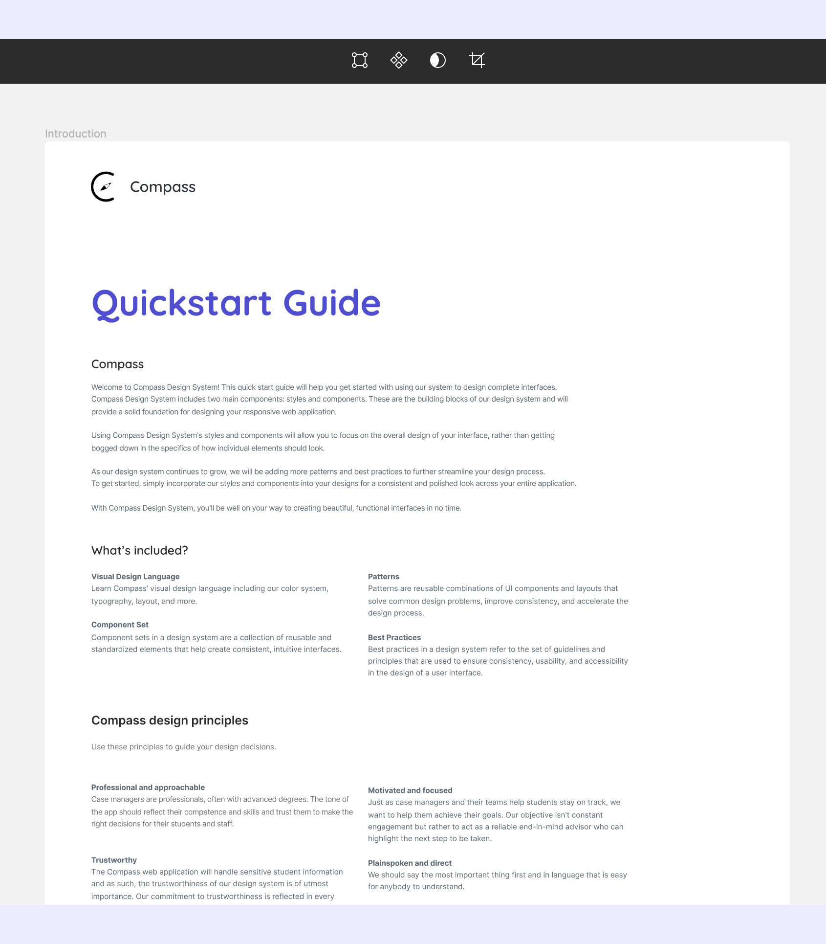
Quick start guides serve as concise, user-friendly resources that enable designers and developers to rapidly onboard.
This document contains resources that help new designers familiarize themselves with Compass' visual design language and general design system knowledge.
Developer specs outline the technical requirements and behavior of each element, ensuring seamless integration between design and development.
The soft launch of Compass’ design system successfully addressed the organization's challenges, including inconsistent design language and an inefficient process. It provided designers with guidelines and ready-made resources that increased the organization's ability to build product, fostered collaboration, and improved cohesion across design teams.
“We as the para team, were able to focus on the experience and after we decided on the experience we wanted, it was super easy to pull in the components and decide how we wanted things to look” - Janice Tam, Para Experience Team Lead
As the design system continues to evolve and adapt, it will support the growth of Compass and contribute to its mission of empowering special education teachers and assistants to better serve their students' needs.
Reflecting back on the process of building my first design system, I learned some valuable lessons:
Looking ahead, our team's next steps involve continuing to create components and patterns to support our design teams and developers, and transitioning our documentation to a live site so our guidelines have a dedicated place to live.