
battleface is an insurance startup that grows revenue through partnerships with other insurers. In these partnerships, other companies sell our products under their own brand name — and in return, they send us monthly sales reports and pay a commission based on those sales.
Earlier this year, our executive team raised a concern: six potential partners had backed out before signing agreements — a major issue since partnerships are one of battleface’s largest revenue streams.
Design: Tyler M, Ethan W
Product Manager: Jay C
Research, Prototyping, B2B Design, Product Strategy, Usability Testing, 0-1 Design
To understand why potential partners walked away, we interviewed key stakeholders — including partner representatives and the service and software engineers who manage partner integrations within battleface’s ecosystem. These conversations revealed deeper issues:
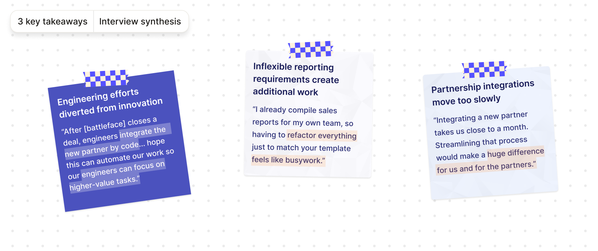
In summary, battleface was losing partnerships because the sales data reporting and integration processes were rigid, manual and difficult to scale. This created a frustrating experience for both partners and our internal team.
Guided by our interview findings, I identified three opportunity areas that our design solution should address. I also met with my PMs to confirm business goals — the most important being to win back the six partnerships that had fallen through earlier in the year.
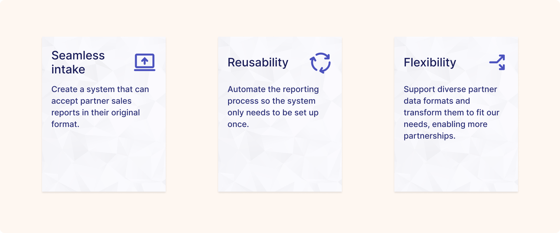
These became the criteria we used to evaluate every solution moving forward.
I also researched how other companies solved similar problems before exploring solutions. These patterns validated the idea of mapping as a mental model, but they fell short in UI clarity and data transformation — both critical needs for our use case.

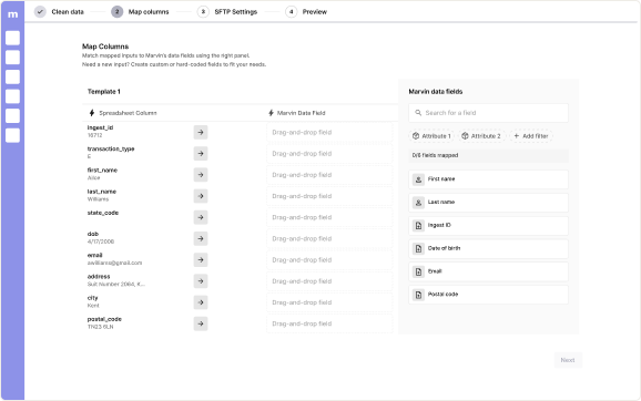
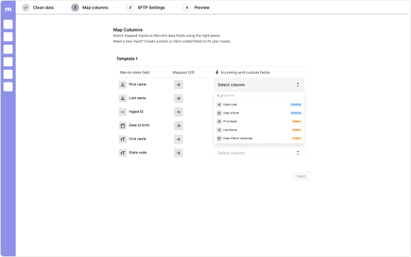
Early explorations and research led to a data field mapping concept within battleface’s internal tool, Marvin. While similar patterns exist on other platforms, this mapper needed to handle the complexity of insurance data — connecting columns from a partner’s sample sales report to the corresponding data fields in our system. The concept enables:
Seeing test participants easily grasp the concept was encouraging. For the first time, we could picture a scalable way to process partner sales data — but I still had work to do to iron out the details.
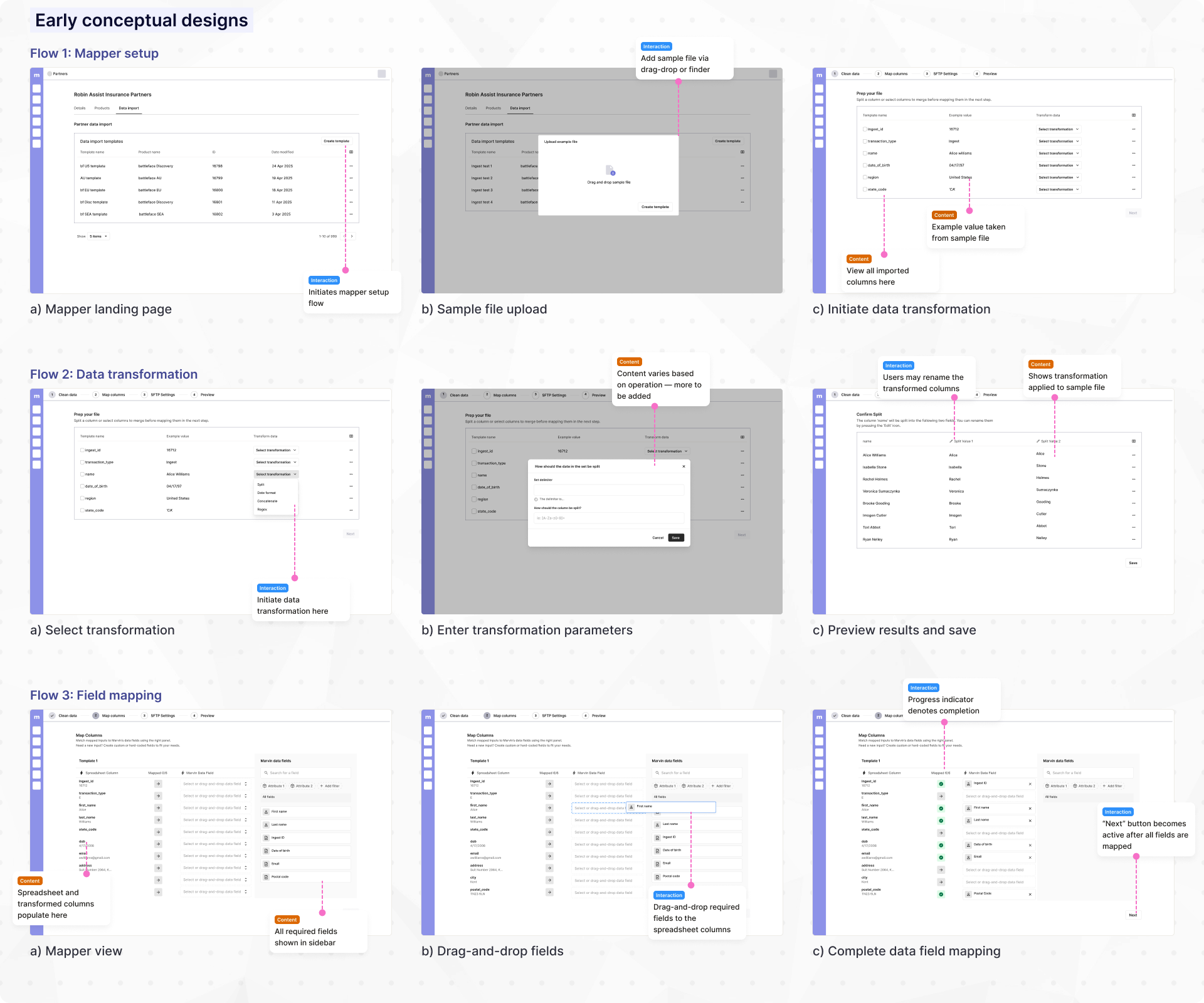
Once the concept was clear, the next challenge was to design a mapping interaction that felt intuitive. This was critical because service engineers needed to map complex insurance data quickly and accurately, without extensive training. My explorations resulted in the following concepts:
✅ Intuitive mental model
⛔ Scales poorly with product requirements
⛔ No custom field management
✅ Scales well with complex products requirements
⛔ Mapping fields not scannable
⛔ No custom field management
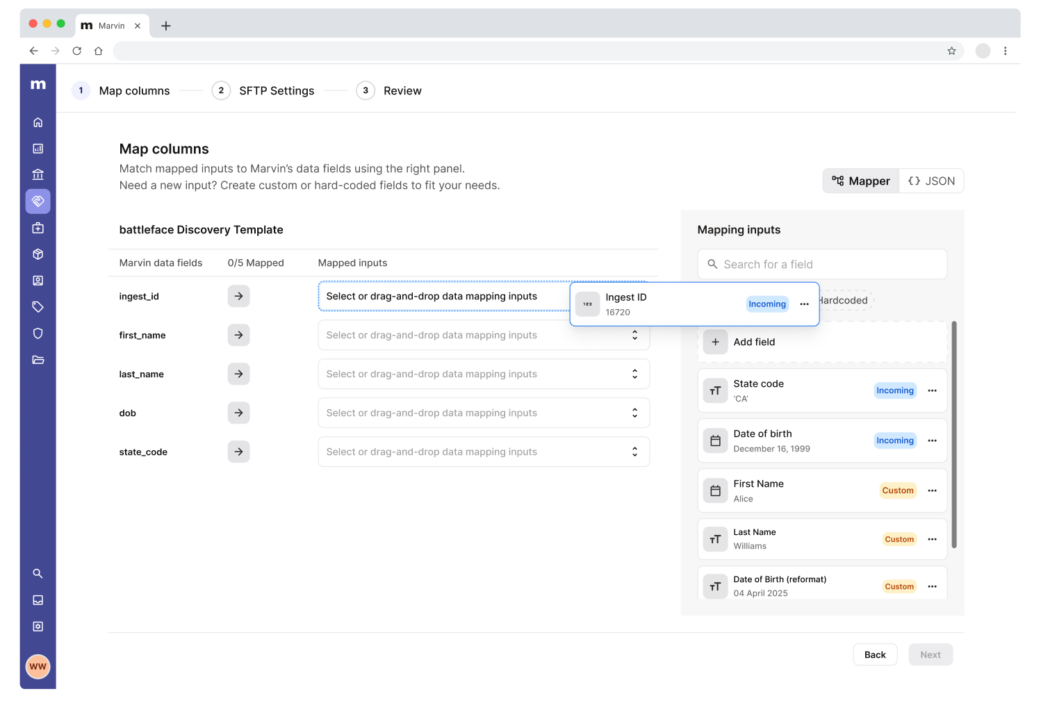
After testing and iteration, I landed on a hybrid design that combines the intuitive mental model of drag-and-drop with the scalability of dropdown inputs. By optimizing the data mapping process, our internal team could create mapping templates with less friction, and accelerate partnership integrations.
I also ran into an unexpected challenge while designing for data transformation. Our initial concept separated the process into three steps: clean data, map fields, and automate — following a progressive disclosure pattern. The goal was to simplify a complex task by focusing users on one step at a time.
During testing, however, this approach started to break down. Users didn’t know what transformations they needed ahead of time, so they would begin mapping, realize something didn’t work, jump back to clean their data, and then return to mapping again.
This back-and-forth created confusion, increased completion time, and introduced the kind of friction we were trying to eliminate in the first place.
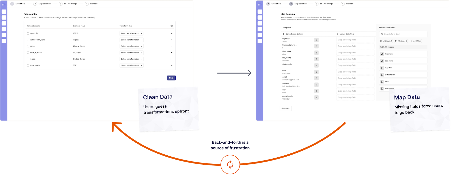
To address this, I shifted the approach and integrated data transformation directly into the mapping flow, reframing it as “Create custom field.” Instead of forcing users to plan transformations upfront, this allowed them to make adjustments in context. This change:
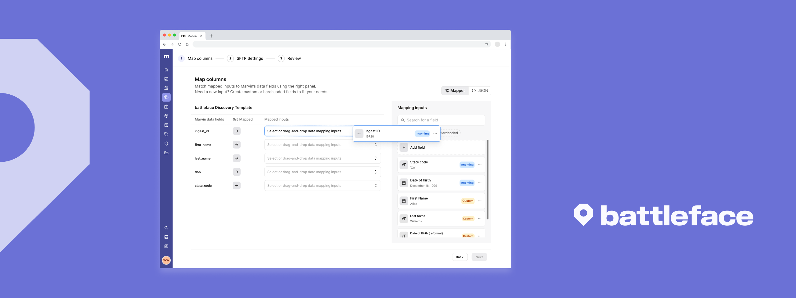
After many cycles of iteration and testing, battleface launched the Data Import feature. Partners can now send insurance sales data as-is, significantly reducing additional work and facilitating onboarding for new partnerships. The feature addressed the core pain points we uncovered during research:
Above is a quick overview of the data import feature. Click here for a more detailed walkthrough.
The impact of the data import feature was immediate – within the first 3 months after launch, the mapper was able to achieve the following:
in partnership revenue generated
33% above target
Improvement in partner onboarding time
Advocating for users in the face of pushback
Looking back, the most valuable lesson I learned from this initiative was advocating for users in the face of engineering pressure. During one of the design-developer syncs, the engineers pushed back on the data transformation preview function. If I were to put myself from two years ago in this situation, I may have backed down. Instead, I was able to create a solution that balanced user' needs and technical feasibility , even if it it meant more work.
Early testing saves effort down the line
Part of the reason why this feature's design went so smoothly was because our team tested the mapper concept early and frequently. This design approach allowed us to validate the design direction and checked our biases.